
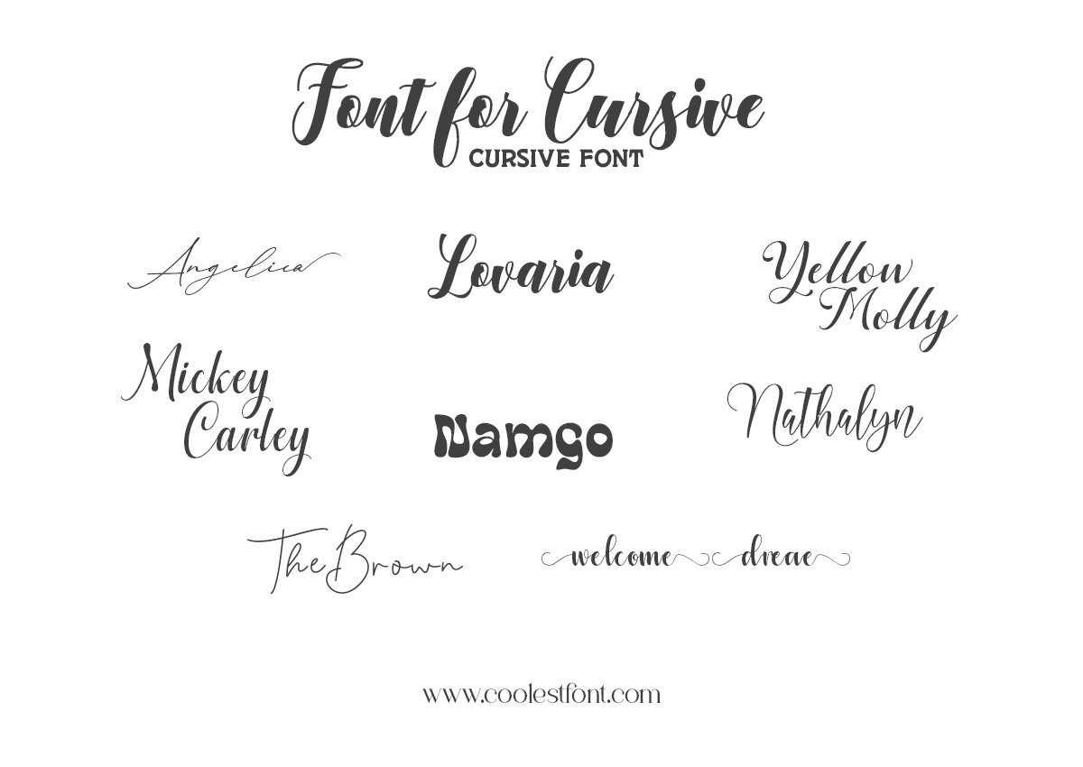
Font for Cursive. A signature logo, a wedding invitation, and a product label need different kinds of cursive lettering. A thin, sweeping script can give a name personality, while a heavier handwritten style may give a short headline more presence. The best choice depends on the words, the available space, and the size at which people will read them.
This guide compares ten cursive fonts from the Coolest Font catalog using their published previews, listed features, and license options. Start with the table, then explore the typefaces that match your project.
For a delicate signature look, begin with Gosseliena or Angelica Signature. For more substantial strokes, compare Lovaria and Amstelan. For visible brush texture, look at Samarata.
How This Shortlist Was Chosen
We reviewed the ten product listings and their published cover specimens, looking at stroke contrast, proportions, flourishes, and potential design uses. Feature descriptions and prices below come from those listings, checked on September 5, 2026.
This is a preview-based guide to our own catalog, not an independent market-wide ranking or a software compatibility benchmark. Project recommendations are editorial judgments based on the specimens. We have not tested the downloadable files across applications or measured small-size readability. Preview your exact wording before choosing a license.
Cursive Font Comparison at a Glance
The fonts are numbered for navigation, not ranked from best to worst. “Demo listed” means a free demo appears in the product’s license selector; it does not mean the full font is free for commercial use.
| Font | Visual direction | A useful starting point for | Listed desktop price | Demo listed |
|---|---|---|---|---|
| Gosseliena | Fine signature strokes and broad flourishes | Personal logos and wedding names | $19 | No |
| Greet Sweet | Tall handwritten forms and large loops | Greeting-card headlines | $16 | Yes |
| Lovaria | Connected script with substantial downstrokes | Wedding names and short titles | $16 | No |
| Lovely Pretty | Light handwriting with decorative swashes | Gift cards and romantic graphics | $18 | No |
| Nathalyn | Calligraphic stroke contrast | Invitations and boutique headings | $18 | Yes |
| Samarata | Textured brush lettering | Artisan labels and creative titles | $16 | No |
| Sweettea | Rounded signature lettering | Lifestyle stationery and branding | $18 | No |
| Wistania | Airy lettering with fine strokes | Minimal packaging and display names | $18 | No |
| Angelica Signature | Slender, slanted signature script | Personal branding and stationery | $18 | Yes |
| Amstelan | Broad handwritten strokes | Short brand names and packaging titles | $18 | No |
Prices are in USD and reflect the listed Desktop License/Standard License option at the time of review. Other license types cost more, and current checkout prices and terms apply. “No” means a demo was not listed in the selector we checked.
10 Cursive Fonts to Consider for Your Next Design
1. Gosseliena — For Sweeping Signature Logos
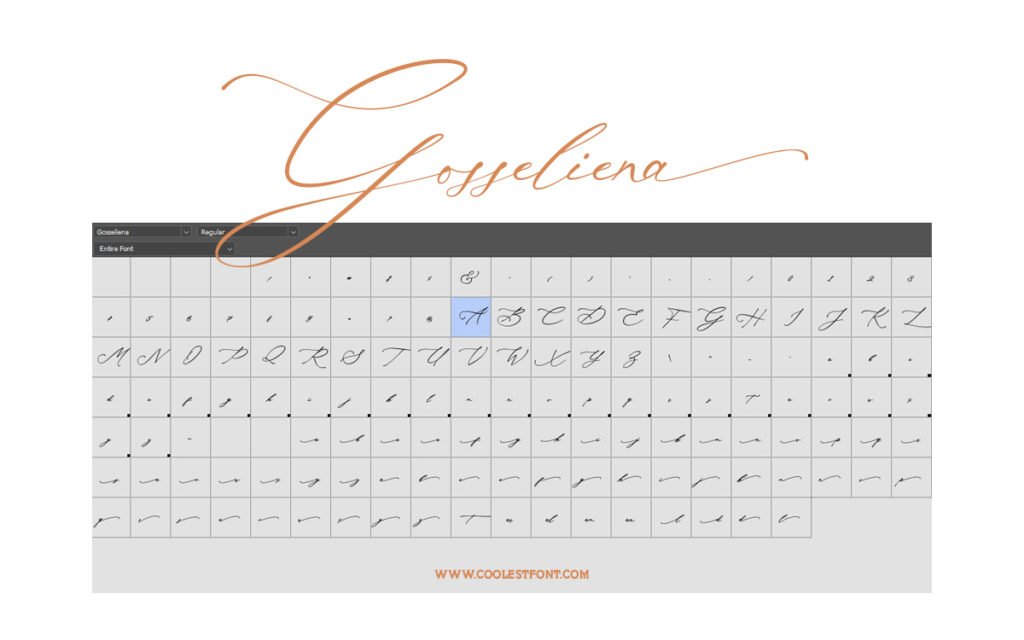
Gosseliena’s catalog specimen shows the wide space needed by its flourished capital.
Gosseliena pairs small flowing lowercase forms with a prominent capital and long finishing strokes. Its published specimen suggests a signature-led direction: the name becomes the main visual element rather than another line of information.
Consider it for a personal brand, photographer’s wordmark, or a couple’s names on stationery. Give the lettering room on both sides, and set supporting details in a simpler typeface.
- Listed features: Uppercase, lowercase, numerals, punctuation, and multilingual support.
- Design check: Make sure extended strokes stay inside the final crop and that fine lines remain visible at the smallest intended size.
- Pairing direction: A restrained sans serif for the business description or contact details.
Preview Gosseliena and view its license options.
2. Greet Sweet — For Expressive Greeting-Card Headlines
Greet Sweet combines tall letterforms with oversized loops in its published preview.
Greet Sweet has a lively handwritten appearance. Its tall forms and generous loops can give a short greeting or gift message an expressive shape without adding illustrations around every word.
Try it for a birthday-card title, a short thank-you message, or the main line on a personalized gift. Keep the longer message in a readable text font.
- Listed features: Ligatures, stylistic alternates, swashes, uppercase, lowercase, numbers, and punctuation.
- Design check: Leave sufficient space between lines so long ascenders and descenders do not collide.
- Demo: A free demo is listed; the desktop license is a separate paid option.
Explore Greet Sweet’s preview and demo options.
3. Lovaria — For Wedding Names With Stronger Strokes
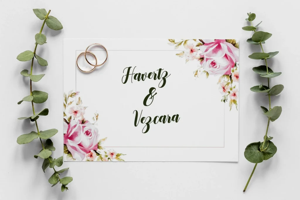
Lovaria’s specimen makes its thick-and-thin stroke contrast easy to see.
Lovaria offers a fuller-looking alternative to the fine signature scripts in this list. Its connected letters and substantial downstrokes make it a candidate for wedding names, short romantic headings, and brand names that need visible weight.
On an invitation, let the script carry the names while a plain serif handles the date, venue, and RSVP information. This separates the expressive lettering from details guests need to read quickly.
- Listed features: Stylistic alternates, ligatures, swashes, and multilingual support.
- Design check: Preview the exact names, including their capitals and any accented characters; the catalog sample cannot show every combination.
- Pairing direction: A simple serif with restrained contrast.
View Lovaria’s specimens and licensing.
4. Lovely Pretty — For Decorative Handwritten Accents
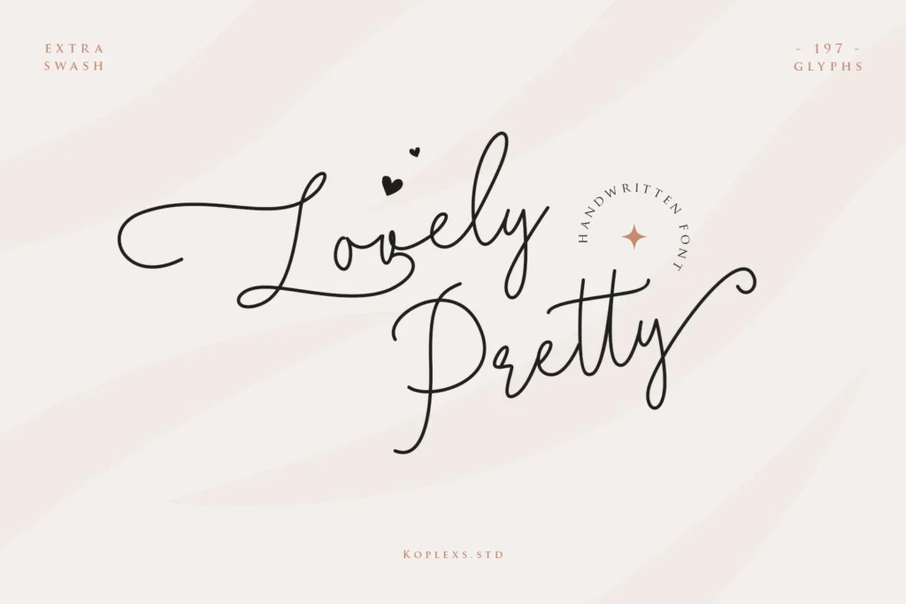
Lovely Pretty’s preview highlights decorative swashes and lists 197 glyphs.
Lovely Pretty uses light handwritten strokes and long decorative extensions. It is worth considering when a short phrase should feel personal: a gift-card heading, a romantic social graphic, or a greeting on custom stationery.
Use the swashes selectively. One expressive beginning or ending can establish the mood while leaving the rest of the layout uncluttered.
- Listed features: Extra swash options and 197 glyphs.
- Design check: Inspect available characters before assuming a particular language is covered; a glyph count alone does not establish language support.
- Pairing direction: A compact sans serif for captions and secondary information.
See Lovely Pretty’s character and swash previews.
5. Nathalyn — For Calligraphic Invitation Headings
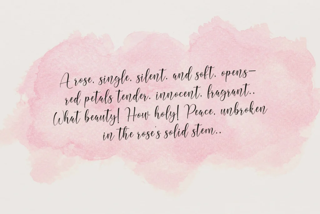
Nathalyn’s specimen shows a looped capital and flowing calligraphic strokes.
Nathalyn’s contrasting strokes give it a calligraphic direction that suits an invitation heading or a boutique title. It provides a different starting point from the comparatively fine, signature-led appearance of Gosseliena and Angelica Signature.
Try a single-line heading with plenty of space above and below it. Keep decorative borders away from the letterforms so the details remain distinct.
- Listed direction: Script calligraphy for stationery, branding, and display typography.
- Design check: Examine joins, descenders, and spacing in your actual phrase before committing to a tightly framed layout.
- Demo: A free demo is listed alongside the paid desktop license.
Preview Nathalyn and compare license options.
6. Samarata — For Textured Brush Lettering
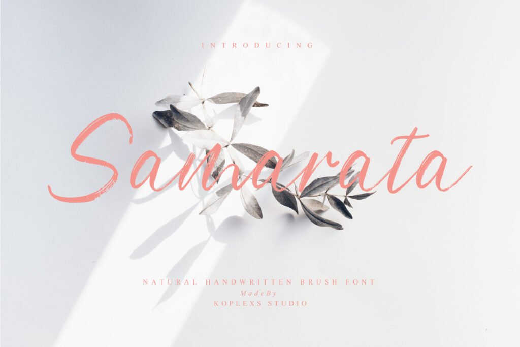
Samarata’s specimen shows visible brush texture within the lettering.
Samarata brings a textured brush treatment to the shortlist. The interruptions and variation within its strokes can suit artisan packaging, creative posters, and short titles that benefit from a handmade appearance.
Try it for the name of a handmade product or a brief campaign headline. Keep ingredients, sizes, and other practical information in a separate text font.
- Listed features: Uppercase, lowercase, numerals, punctuation, and special characters.
- Design check: Texture needs inspection at the final output size. For foil, embroidery, or cutting applications, check the production requirements before choosing a distressed treatment.
- Pairing direction: A plain sans serif that contrasts with the brush texture.
Explore Samarata’s brush-script specimens.
7. Sweettea — For Rounded Signature Lettering
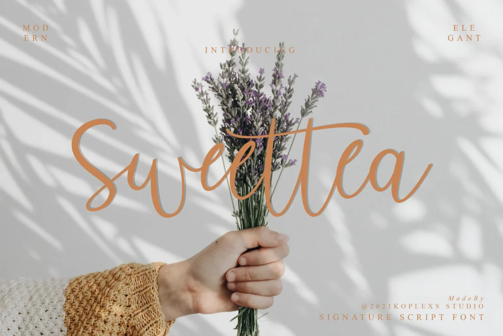
Sweettea’s rounded curves create a softer signature direction in the catalog preview.
Sweettea offers broad, rounded movements that make it a candidate for lifestyle stationery, personal branding, or a short product name. Compared with an extremely fine signature treatment, its preview gives the lettering a fuller visual presence.
Use the script as the central name or phrase, then build a quiet supporting layout around it. Test alternative characters only where they improve the shape or rhythm of the word.
- Listed features: Alternate characters, ligatures, and multilingual support.
- Design check: Review the complete name with the intended capitalization; a decorative capital may need more room than the lowercase letters.
- Pairing direction: A straightforward serif for supporting stationery text.
View Sweettea’s previews and listed features.
8. Wistania — For Airy, Minimal Display Lettering
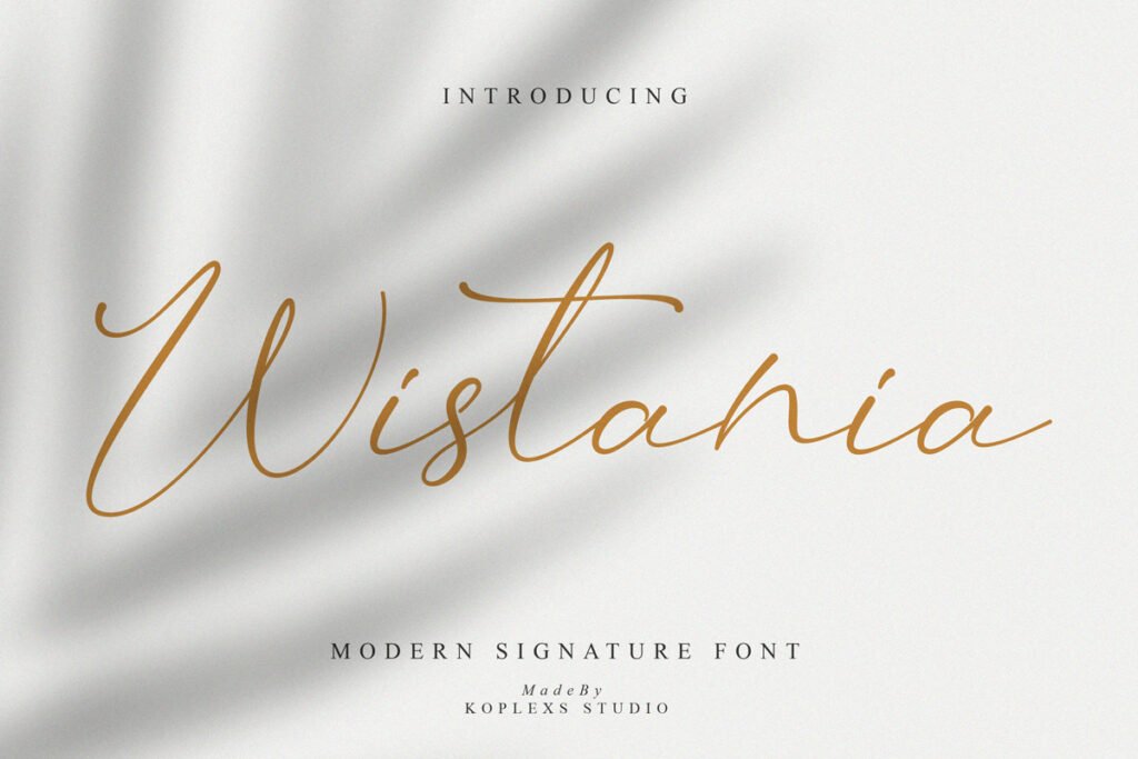
Wistania’s published specimen uses fine strokes and an open, airy composition.
Wistania is sold as a modern calligraphy font, while its cover also shows a signature-like treatment. Its fine strokes and extended forms suggest an airy direction for a short product name, a spacious label, or an editorial display heading.
Pair it with a clean background and adequate contrast. If the design has to work on a small label, inspect a true-size print before deciding that the lettering is sufficiently clear.
- Listed features: Alternate characters, ligatures, and multilingual support.
- Design check: Pay particular attention to thin lines against photographs, reflective packaging, or pale colors.
- Pairing direction: A restrained sans serif for product details.
Explore Wistania’s modern calligraphy previews.
9. Angelica Signature — For Slender Personal Wordmarks

Angelica Signature presents a slender, slanted alternative for personal branding.
Angelica Signature is a useful starting point for a personal wordmark or the name on business stationery. Its specimen uses fine strokes and a slanted rhythm, giving it a quieter appearance than the heavier scripts in this collection.
For a photography watermark, test the lettering over both light and dark areas of an image. A name that reads well on the catalog background may need a different color or more space in the final photograph.
- Listed direction: Signature-style handwriting with a vintage influence.
- Design check: Preserve recognizable letters when choosing decorative variants or fitting the name into a small area.
- Demo: A free demo is listed; commercial permissions depend on the purchased license.
Preview Angelica Signature and its demo option.
10. Amstelan — For Substantial Handwritten Brand Names
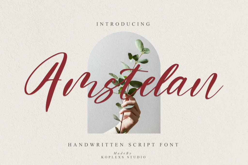
Amstelan’s heavier strokes offer a different direction from the delicate signature styles.
Amstelan has broad downstrokes and flowing connections in its published cover. Consider it when a short brand name or packaging title needs a more substantial handwritten shape.
Compare it with Lovaria using the same wording. Look at the capital, the width of the finished word, and the space available inside the letters rather than choosing from the font names alone.
- Listed features: Uppercase, lowercase, numbers, punctuation, and multilingual support.
- Design check: Closely inspect joins and counters when reducing the design; heavier strokes do not automatically guarantee small-size readability.
- Pairing direction: A simple sans serif for practical information.
See Amstelan’s specimens and license options.
How to Choose a Cursive Font for Your Project
For Logos and Personal Branding
Start with the exact brand name. Compare the opening capital, the width of the word, and the shape of any finishing stroke. Gosseliena and Angelica Signature offer fine signature directions; Amstelan offers a more substantial alternative.
Then place the wordmark where it will actually appear: a website header, an avatar, a business card, or a product label. A design that depends on a long flourish may need a separate compact arrangement for small spaces.
For Wedding Invitations
Start with Lovaria or Nathalyn for the names or main heading. Compare Lovely Pretty when you want a lighter, more decorative handwritten accent.
Keep the date, address, RSVP details, and other essential information in a clear text typeface. Include the actual names and accents in the preview, then print the invitation at its intended size.
For Packaging and Social Graphics
Samarata provides brush texture, Sweettea offers a rounded signature direction, and Wistania suggests fine display lettering. Compare them against the material, background, and available space in your design.
For a social post, inspect the exported image on a phone. For packaging, inspect a printed proof. Do not let an attractive close-up hide weak contrast or details that disappear at the final size.
How to Pair Cursive Fonts Without Losing Readability
Give the cursive font one clear role: a name, heading, or short phrase. Use a supporting serif or sans serif for the information around it.
Start with these layout directions:
- Signature plus sans serif: A personal name in script, with the job title and contact details below.
- Calligraphy plus serif: Wedding names in script, with the date and venue in a restrained serif.
- Brush plus sans serif: A product name in textured lettering, with specifications in plain text.
Avoid competing flourishes in both fonts. Compare proportions and spacing using the finished words, not just the family names. Our guide to script alphabet fonts offers more examples of script styles used in branding.
A Practical Check Before You Download or Publish
Use this repeatable preview process to narrow your shortlist:
- Enter your real project text. Add a consistent comparison phrase such as “Amelia Studio” or “Made with care.”
- Inspect a large headline, a medium heading, and your smallest intended use. On-screen trials at 72, 48, and 24 px can help reveal differences, but they are not universal pass/fail sizes.
- Check every required capital, numeral, punctuation mark, and accented character. Product claims of multilingual support do not identify every supported language.
- Begin with default letter spacing. Inspect the joins before adjusting tracking in a connected script; also check word spacing, line height, and swash collisions.
- Export or print a sample. Make the final decision at the actual viewing size and on the intended background.
For ordinary web text, WCAG’s minimum contrast thresholds are 4.5:1 for normal text and 3:1 for large text. Thin or unusual letterforms may benefit from stronger contrast. See the W3C contrast guidance for definitions and exceptions.
For a broader explanation of the styles in this category, read our cursive handwriting guide.
Check the Font License Before Using It Commercially
A free demo and a paid commercial license serve different purposes. At the time of review, Greet Sweet, Nathalyn, and Angelica Signature listed demo options. The store’s free-personal-use terms restrict those downloads to noncommercial use and describe a limited character set.
Choose the license for the actual project. A website that embeds font files, a trademarked logo, and a printed product can involve different permissions. Do not assume the desktop option covers every application, and do not redistribute font files to clients or collaborators without checking the terms.
Read the current font license options before purchasing. If the intended use is unclear, ask the seller to confirm the appropriate license.
Frequently Asked Questions
Which Cursive Font Should I Try First?
Choose by the job. For a fine signature look, start with Gosseliena or Angelica Signature. For a stronger handwritten heading, compare Lovaria and Amstelan. For visible brush texture, start with Samarata. Preview the same words in your shortlisted fonts before deciding.
Are These Cursive Fonts Free?
Some have free demos, but the full commercial licenses are paid. A zero-dollar price in a product selector can refer to a demo rather than unrestricted use. Check both the selected option and the license terms.
Can I Use Cursive Fonts for Long Paragraphs?
Use these decorative scripts primarily for names, headings, and short phrases. For instructions, descriptions, addresses, or longer messages, choose a readable supporting font and reserve the script for emphasis.
Will the Swashes and Alternates Work in My Design App?
That depends on the font package and the application’s support for the relevant features. Check the supplied formats and how your app exposes OpenType alternates or glyph selection. A demo may omit features that are included in the full version.
Can I Use One of These Fonts in a Business Logo?
Check the license for the intended logo use, including whether the logo will be trademarked. The store lists a dedicated Trademarked Logo License, so a desktop purchase should not be treated as blanket permission for every branding use.
Where Can I Preview More Cursive Fonts?
Browse the cursive font collection, then open the individual product pages to compare specimens and available license options. Keep two or three candidates and test your final wording before purchasing.
Choose the Font That Works With Your Words
The most useful comparison is the same name or phrase in several typefaces at the size you will use. Shortlist by style, check the necessary characters, inspect a final-size proof, and choose the license that matches the project. That process will tell you more than a decorative cover image or a “best font” label alone.



Leave a Comment