Discover the different types of typeface classifications, their unique characteristics, and how to use them effectively in design projects. Learn about serif, sans serif, script, and decorative styles.
Types of Typefaces
Typography is more than just letters on a page; it’s an art form that combines functionality and aesthetics. As a designer, I’ve always been fascinated by the way typefaces shape our perception of text and, ultimately, the message it conveys. Understanding the different types of typefaces can elevate your design skills and help you choose the right font for any project.
In this article, I’ll dive deep into the fascinating world of typeface classifications, exploring categories such as serif, sans serif, script, and decorative styles. Whether you’re a novice designer or a seasoned professional, this guide will help you master the nuances of typography and make informed decisions.
What is a Type of Typeface?
Before we delve into the classifications, it’s essential to understand what a typeface is. A typeface refers to a family of fonts sharing common design characteristics. For example, Times New Roman is a typeface, while its different weights and sizes—such as bold or italic—are individual fonts.
The primary goal of any typeface is to convey a message, but how that message is perceived depends largely on the typeface’s design.
The Four Main Typefaces Categories
Typography can be broadly categorized into four main styles: serif, sans serif, script, and decorative. Each of these categories has its subtypes, offering designers a versatile palette of styles to work with.
1. Serif Type Styles
Serif typefaces are characterized by small strokes, or “serifs,” at the ends of their letters. They are often associated with tradition, reliability, and elegance. These typefaces are widely used in print media because of their readability and timeless appeal. Let’s explore their subcategories in detail:
Old Style
- Characteristics: Organic, curved strokes; minimal contrast between thick and thin lines. Letters often have a diagonal stress, reflecting their calligraphic origins.
- Examples: Garamond, Palatino, Caslon.
- Usage: Perfect for book typesetting, academic texts, and formal documents where a classic and warm feel is desired.
Old Style serifs date back to the 15th and 16th centuries and are rooted in traditional handwritten scripts. Their slightly uneven strokes and organic shapes exude a sense of authenticity and craftsmanship.
Transitional
- Characteristics: Higher contrast between thick and thin strokes compared to Old Style; sharper and more refined serifs. Stress in the letters is more vertical.
- Examples: Times New Roman, Baskerville.
- Usage: Common in magazines, newspapers, and websites for a balance of modernity and tradition.
Transitional serif typefaces mark the evolution from Old Style to Neoclassical designs. They combine the warmth of Old Style with sharper details, making them versatile and widely used.
Neoclassical & Didone
- Characteristics: Extreme contrast between thick and thin lines; vertical stress; minimal or hairline serifs.
- Examples: Bodoni, Didot.
- Usage: Ideal for luxury branding, fashion editorials, and sophisticated design projects.
These typefaces emerged in the late 18th century, embracing precision and elegance. Their dramatic contrast and refined lines make them eye-catching, though less suited for body text due to their reduced readability at smaller sizes.
Slab Serif
- Characteristics: Thick, block-like serifs; minimal contrast in stroke weight; sturdy and bold appearance.
- Examples: Rockwell, Courier, Clarendon.
- Usage: Often used in advertising, posters, and headlines where boldness is required.
Slab serif typefaces became popular in the 19th century during the industrial revolution. Their robust and impactful design makes them ideal for capturing attention in bold statements.
Clarendon
- Characteristics: Rounded, bracketed serifs; friendly and approachable design with a touch of softness.
- Examples: Clarendon, Century Schoolbook.
- Usage: Works well in posters, signage, and educational materials.
Clarendon-style serifs bridge the gap between Slab Serifs and traditional designs, offering versatility for both decorative and functional use cases.
Glyphic
- Characteristics: Tapered strokes and triangular serifs that give an engraved appearance.
- Examples: Albertus, Perpetua.
- Usage: Suitable for inscriptions, logos, and elegant designs requiring a timeless feel.
Glyphic typefaces are inspired by stone engravings, lending a sense of permanence and sophistication to their applications.
Serif typefaces, with their rich history and varied styles, provide designers with a broad spectrum of options to suit different contexts. Whether you’re aiming for traditional elegance, modern sophistication, or bold impact, there’s a serif typeface for every project.
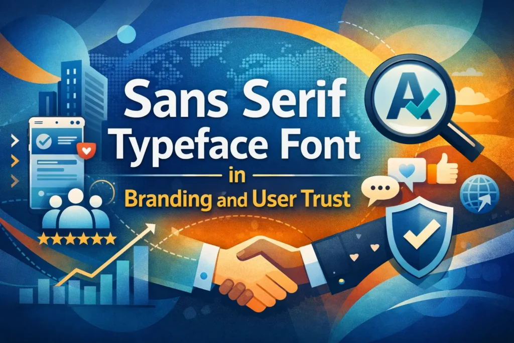
2. Sans Serif Type Styles
Sans serif typefaces, as the name suggests, lack the small decorative strokes (serifs) found at the ends of letters in serif fonts. This absence gives them a clean, straightforward, and contemporary look, making them ideal for modern designs and digital screens. Let’s explore the main subcategories of sans serif typefaces.
Grotesque
- Characteristics: Grotesque typefaces are among the earliest sans serif designs, characterized by their slightly squared curves and minimal variation in stroke width. Their forms are utilitarian and often exhibit a sense of rigidity.
- Examples: Akzidenz-Grotesk, Franklin Gothic.
- Usage: Grotesque fonts are frequently used in headlines, signage, and any design requiring a bold, authoritative presence.
Square
- Characteristics: Square sans serifs feature geometric shapes with sharp angles and clean, structured lines. These typefaces often exude a futuristic and technical vibe.
- Examples: Eurostile, Bank Gothic.
- Usage: They are perfect for projects that demand a tech-oriented or modern aesthetic, such as branding for technology companies and sci-fi themes.
Humanistic
- Characteristics: Inspired by traditional calligraphy, humanistic sans serifs incorporate natural, flowing lines, making them warmer and more relatable than their geometric counterparts.
- Examples: Gill Sans, Optima.
- Usage: Ideal for branding, editorial layouts, and user interfaces where a human touch is essential.
Geometric
- Characteristics: Geometric sans serifs are based on simple geometric shapes, such as circles and squares. These typefaces are often clean, minimalist, and highly symmetrical.
- Examples: Futura, Avenir.
- Usage: They work well in modern, minimalist designs, including logos, posters, and corporate materials.
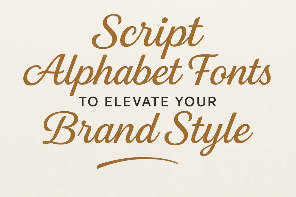
3. Script Type Styles
Script typefaces mimic handwriting and calligraphy, adding a personal touch to designs. They’re often used for decorative and special purposes. Let’s explore the various subcategories:
Formal
- Characteristics: Formal script typefaces are elegant, with flowing lines and high contrast between thick and thin strokes. They often imitate traditional cursive handwriting or calligraphy used in formal documents.
- Examples: Bickham Script, Edwardian Script.
- Usage: Perfect for wedding invitations, certificates, and any project requiring a sophisticated touch.
Casual
- Characteristics: Casual scripts have a relaxed, informal appearance, often featuring brush-like strokes or uneven baselines. They are less structured than formal scripts, giving them a friendly and approachable vibe.
- Examples: Pacifico, Comic Sans.
- Usage: Best suited for playful designs, children’s books, and informal branding projects.
Calligraphic
- Characteristics: These typefaces mimic traditional calligraphy styles, often characterized by artistic and ornate details. They may include flourishes or decorative elements.
- Examples: Zapfino, Lucida Calligraphy.
- Usage: Suitable for elegant branding, book covers, and decorative text elements.
Blackletter & Lombardic
- Characteristics: Blackletter typefaces feature intricate, Gothic-style lettering, while Lombardic scripts are more ornate with decorative flourishes. These styles are reminiscent of medieval manuscripts.
- Examples: Old English, Textura.
- Usage: Commonly used in formal or historical contexts, such as certificates, logos, or branding that evokes tradition and authority.
4. Decorative Type Styles
Decorative typefaces are highly stylized and designed to grab attention. They are used sparingly to make bold visual statements. Here are the key subcategories:
Grunge
- Characteristics: Grunge typefaces have a distressed, weathered look, often featuring rough edges, irregular textures, or faded appearances. They evoke an edgy and rebellious mood.
- Examples: Bleeding Cowboys, TrashHand.
- Usage: Ideal for alternative music posters, edgy branding, and designs that require a rugged aesthetic.
Psychedelic
- Characteristics: Psychedelic fonts are whimsical and often incorporate wavy lines, exaggerated curves, and vibrant, bold forms. They are reminiscent of the 1960s and 1970s design trends.
- Examples: Hobo, Funkadelic.
- Usage: Perfect for retro-themed projects, album covers, and experimental art pieces.
Graffiti
- Characteristics: These fonts are inspired by street art and urban graffiti. They often feature bold, irregular shapes and dynamic layouts that emulate spray-painted letters.
- Examples: Tag Type, Graffont.
- Usage: Great for youth-centric branding, urban event posters, or any project aiming for a gritty, contemporary feel.
Choosing the Right Typeface
Selecting the right typeface is a crucial step in any design process. The choice can significantly impact how your message is perceived. Here are some considerations:
- Purpose: Start by identifying the goal of your project. Is it formal, casual, or experimental? For formal documents, choose serif or formal script fonts. For casual or playful designs, consider casual script or decorative styles.
- Audience: Understanding your target audience helps refine your selection. For example, younger audiences may resonate with graffiti or geometric sans serif fonts, while professional audiences might prefer serif or humanistic sans serif fonts.
- Readability: Ensure the typeface is legible, especially for body text. Serif and sans serif fonts are ideal for long passages, while decorative fonts should be reserved for headings or short phrases.
- Brand Alignment: Match the typeface with your brand’s personality. A tech company might lean towards geometric sans serif fonts, while a luxury brand might opt for neoclassical serif or formal script fonts.
- Context of Use: Consider the medium—print, digital, or both. Sans serif fonts work well for digital screens due to their clean lines, whereas serif fonts excel in printed materials for their readability and classic appeal.
Pro Tip
When combining typefaces, aim for contrast without clashing. For instance, pair a serif font with a sans serif font to create a balanced and visually appealing design.
FAQs
1. What is the difference between a typeface and a font?
- A typeface is the design style, while a font is a specific weight or size of that typeface.
2. Are serif fonts outdated?
- Not at all! Serif fonts are timeless and often used in formal or traditional settings.
3. Can I mix typefaces in a single project?
- Yes, but use no more than two or three to maintain visual harmony.
4. What’s the best typeface for digital screens?
- Sans serif fonts like Arial and Helvetica are easier to read on screens.
Conclusion
Typography plays a crucial role in design, and understanding the types of typefaces ensures you’re making informed choices. Whether you’re designing for print or digital, the right typeface can make or break your project’s impact.
So, what’s your favorite typeface style? Share your thoughts in the comments below, and don’t forget to explore other typography articles on my site!


Leave a Comment