
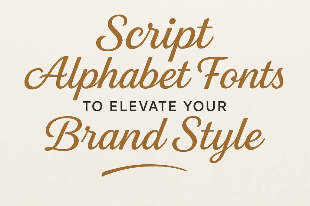
Sans Serif Popular Fonts. Look around you. From your smartphone interface to your favorite brand’s logo, sans serif fonts are everywhere. Their clean lines, open shapes, and balanced spacing make them not only visually appealing but also emotionally reassuring.
In today’s fast-paced digital world, attention spans are shorter, and clarity is everything. This is why sans serif popular fonts have become the visual language of modern communication. In this article, we will explore their history, their defining features, and why they remain essential for brands, designers, and readers who value simplicity and precision.
Read More : Preppy Fonts That Elevate Your Aesthetic Instantly
Understanding the Essence of Sans Serif Fonts
A Brief Look at the Origin
The term “sans serif” comes from the French word sans meaning “without.” These fonts remove the little decorative extensions found in serif typefaces, resulting in a sleek and minimalist appearance.
The first sans serif fonts appeared in the early 19th century, but their popularity surged during the modernist movement of the 20th century when designers began embracing simplicity and functionality.
Why Designers Love Sans Serif Fonts
Sans serif fonts are versatile, legible, and timeless. They adapt easily across various media, from print ads to digital platforms. Because of their balanced geometry and neutral tone, they blend seamlessly into almost any design style.
Here’s a quick overview of what makes them so effective:
| Key Feature | Why It Matters |
|---|---|
| Clean shapes | Easier to read at any size |
| Even weight distribution | Improves balance and harmony |
| Minimal visual noise | Enhances message clarity |
| Modern aesthetic | Projects professionalism and innovation |
Read More : Everything You Need to Know About Papyrus Font
Classic and Timeless Sans Serif Fonts
Some fonts transcend design trends and remain iconic for decades. These are the fonts that define eras, inspire new generations of designers, and set the standard for readability.
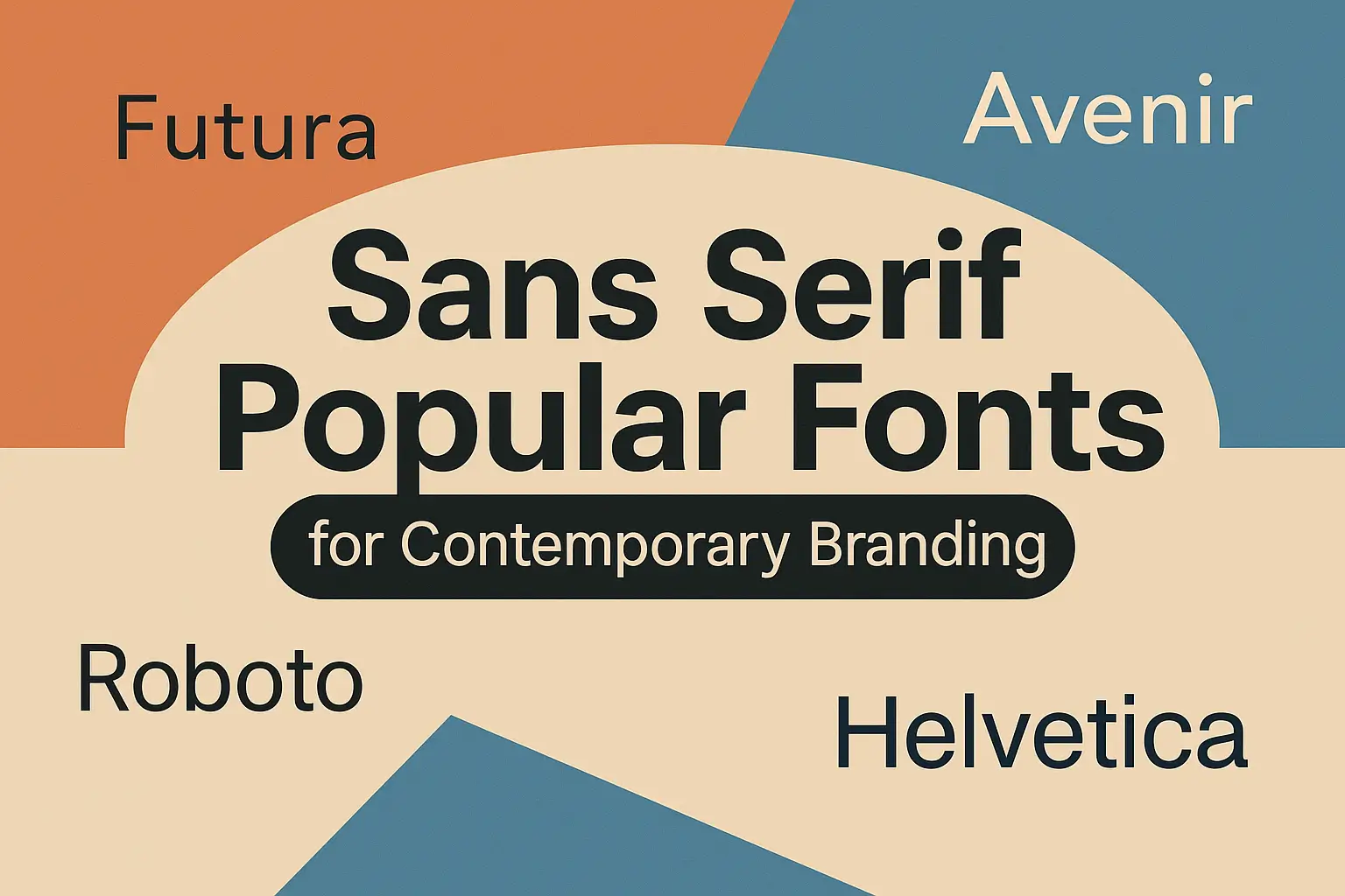
Helvetica
Often referred to as the most influential typeface of all time, Helvetica represents balance and clarity. It’s the go-to choice for brands like BMW, Panasonic, and The North Face. Its neutrality allows it to communicate confidence without distraction.
Futura
With geometric precision and forward-looking design, Futura feels both retro and futuristic at once. It’s often seen in technology brands, packaging, and fashion advertising, thanks to its modern appeal.
Avenir
Avenir strikes a perfect balance between humanist warmth and geometric structure. It’s often used in web design, app interfaces, and editorial layouts, where elegance meets functionality.
Read More : Fancy Lettering Alphabet: A Complete Guide to Beautiful Handwritten Styles
Sans Serif Fonts for the Digital Era
In today’s screen-driven culture, font legibility on digital displays is crucial. The following sans serif fonts dominate the online space for good reason.
Roboto
Created by Google for Android, Roboto is optimized for maximum readability. Its letterforms feel mechanical yet friendly, making it ideal for both mobile apps and websites.
Open Sans
One of the most downloaded fonts in the world, Open Sans combines humanist style with perfect on-screen clarity. It works beautifully for blogs, business pages, and e-learning platforms.
Montserrat
Inspired by the traditional signage of Buenos Aires, Montserrat delivers a clean and urban feel. It’s often used for bold web headers, creative portfolios, and branding visuals.
Lato
Lato offers a soft, friendly tone while maintaining a professional image. Its rounded edges make it ideal for corporate websites that aim to appear approachable and trustworthy.
Poppins
Geometric and versatile, Poppins has become a favorite among startups and tech companies. It provides excellent readability across devices and brings a polished look to digital layouts.
Inter
Designed specifically for user interfaces, Inter has an open design that improves legibility on small screens. Its tall x-height ensures that every character remains clear, even at compact sizes.
Source Sans Pro
Adobe’s first open-source typeface, Source Sans Pro, balances neutrality and warmth. It’s a great choice for technology companies, educational institutions, and modern professional brands.
Read More : Discover Unique Aesthetic Fonts to Elevate Your Design Style
Other Notable Sans Serif Popular Fonts to Explore
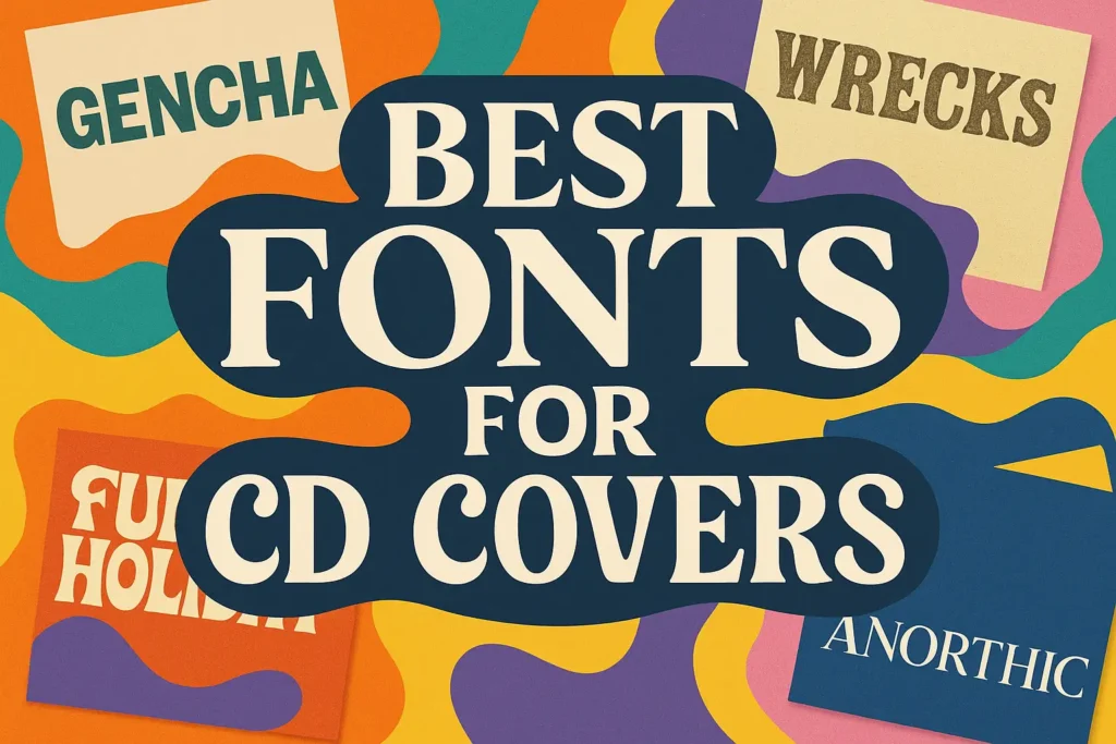
Gencha Font
This font offers a bold and modern style perfect for striking headlines. It stands out in branding design thanks to its sharp geometry and confident character.
Hipo Font
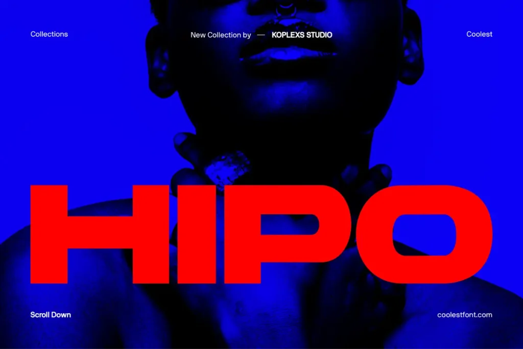
Hipo is crafted with friendly curves and a clean sans serif feel, making it great for body text and user interfaces where readability and approachability matter.
Barytons Font
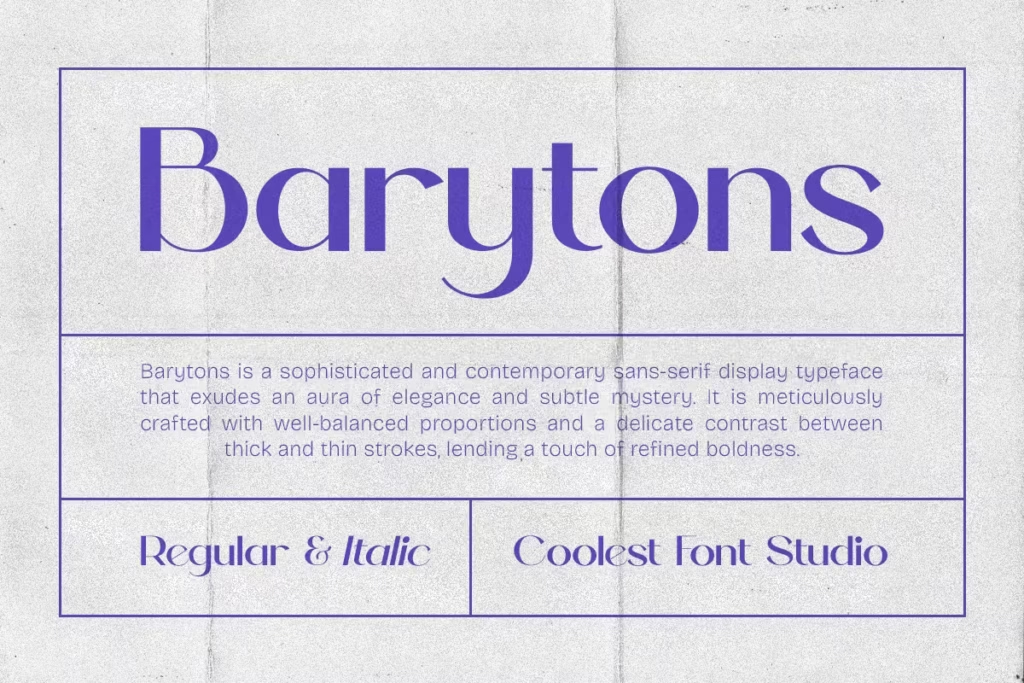
Barytons features distinctive letterforms with subtle uniqueness, ideal for editorial layouts or logo design where you want a little personality without sacrificing clarity.
Cofigra Font
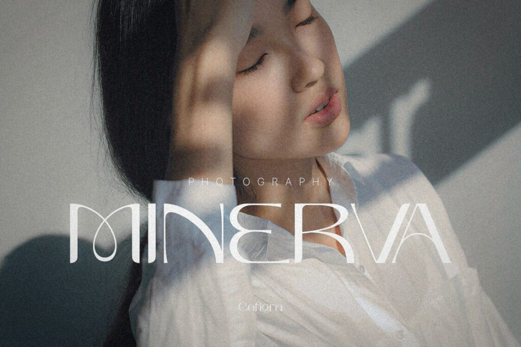
Cofigra is a versatile typeface with refined simplicity. Its smooth lines and balanced proportions work well across both print and digital design projects.
Saloums Font
Saloums brings a stylish and contemporary vibe. With its light and airy letterforms, this font is excellent for minimalistic web design or elegant branding applications.
Wrecks Font

Wrecks presents a strong, assertive character—suitable for posters, packaging, or any visual where you need the type to make an impact immediately.
Bourne Font

Bourne combines modern minimalism with subtle humanist touches. It performs well in professional settings like corporate communications while maintaining a bit of warmth.
Backfarm Font

Backfarm delivers a clean, straightforward sans serif that is well suited for user-interfaces, apps, and websites. Its simplicity supports fast readability and efficient design.
Read More : Discover the Best Bubble Letter Font Styles for Creative Projects
How Sans Serif Fonts Influence Brand Perception
Typography affects how people feel about a brand. A single typeface can suggest trust, excitement, or innovation. According to a study by Forbes, companies with consistent typography experience up to a 23 percent increase in brand recognition.
Consider the following real-world examples:
- Google uses Roboto and Product Sans to reflect modern simplicity and accessibility.
- Netflix created Netflix Sans, a custom font that enhances scalability and reinforces its brand voice.
- Spotify utilizes a modified sans serif to emphasize creativity and energy.
The key takeaway is that fonts are more than just text. They communicate values, tone, and vision without saying a word.
Read More : Mastering Beautiful Calligraphy Alphabets for Beginners
How to Choose the Right Sans Serif Font
Selecting the right font is not about trendiness alone. It’s about alignment with your message and target audience. Here are some practical considerations:
- Purpose
Determine the medium. For print materials, Helvetica and Futura offer clarity and style. For web use, Roboto or Open Sans are better suited. - Brand Personality
A tech company might prefer Poppins for its geometric precision, while a creative studio may choose Montserrat for its expressive character. - Readability
Always test fonts at different sizes and weights. A font that looks good on a poster may not perform well on a mobile interface. - Consistency
Use no more than two or three typefaces in a single design. This ensures visual harmony and avoids confusion.
Recommended Tools for Font Exploration
To experiment and find your perfect typeface combination, try these reliable tools:
- Google Fonts – Free and user-friendly, perfect for web-safe options.
- Adobe Fonts – A professional library for designers seeking premium choices.
- Fontpair.co – Helps you pair sans serif fonts with complementary typefaces.
- WhatFont Tool – A browser extension that identifies fonts on any website.
Read More : Tattoo Font Styles: Best Fonts to Inspire Your Next Ink
Conclusion
Sans serif fonts are more than just a design choice. They represent a mindset focused on clarity, simplicity, and modern communication. From the clean professionalism of Helvetica to the digital precision of Roboto, these fonts define the visual tone of our age.
If you are designing a brand identity, a website, or a product interface, choosing the right sans serif font can elevate your message and strengthen your credibility.
Now is the perfect time to experiment, explore, and find the typeface that aligns best with your creative vision.
FAQ About Sans Serif Popular Fonts
What makes sans serif fonts different from serif fonts?
Serif fonts have small decorative lines at the ends of their strokes, while sans serif fonts do not. This makes sans serif fonts look cleaner and more modern.
Which sans serif font is most popular for digital design?
Roboto and Open Sans are among the most used due to their high readability and compatibility with multiple screen resolutions.
Are sans serif fonts suitable for print?
Absolutely. Fonts like Helvetica and Avenir are timeless in both print and digital formats, offering clarity and style.
What is the most versatile sans serif font?
Helvetica remains the most versatile due to its balanced design and universal appeal.
Can I mix different sans serif fonts in one design?
Yes, but use contrast wisely. Pairing a geometric font like Futura with a softer one like Lato can create visual balance and distinction.


Leave a Comment