Ever feel like your message isn’t quite landing? Like your words are there, but the oomph is missing?
It might not be your writing, but the way it’s presented. Think of typography as the unsung hero of storytelling, the visual voice that amplifies your words.
In this article, we’ll dive into how to use typography to enhance your storytelling, transforming your text from plain words into a captivating experience. Get ready to unlock the power of fonts!
The Power of Typography in Storytelling
Typography isn’t just about picking a pretty font. It’s about carefully selecting and arranging type to create a visual hierarchy, evoke emotions, and ultimately, enhance the reader’s understanding and engagement with your story.
It’s the art of visual communication with text.
Think of it as the music score to your words – setting the mood and guiding the reader through your narrative.
Why Typography Matters
Good typography can make or break a story.
Imagine reading a suspenseful thriller in a playful, childish font – the tension would vanish instantly!
Typography impacts readability, legibility, and overall aesthetic appeal. It communicates personality, tone, and even historical context.
Essentially, it’s a crucial element in crafting a compelling and immersive narrative experience.
Typography and Emotional Connection
Fonts have personalities. Serifs can feel traditional and authoritative, while sans-serifs often appear modern and clean.
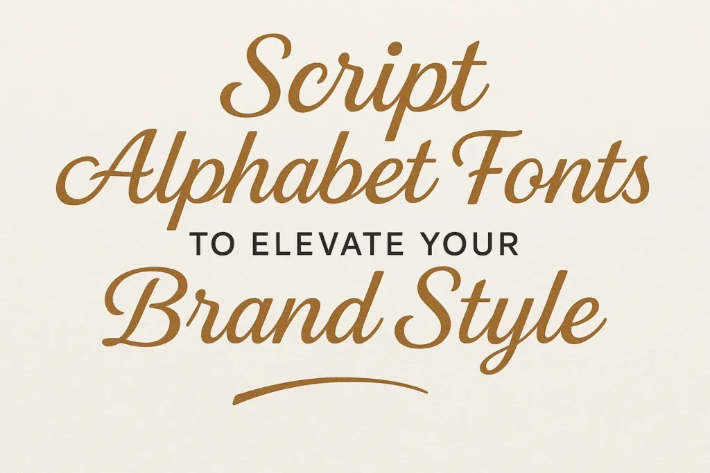
Script fonts can be elegant and romantic.
By carefully choosing fonts that align with the tone and theme of your story, you can subtly influence the reader’s emotions and create a deeper connection to the narrative.
Key Elements of Typography for Storytelling
Mastering typography involves understanding several key elements. These elements work together to create a visually appealing and effective design.
Let’s break down the core components.
Font Selection: Choosing the Right Voice
Selecting the right font is paramount. Consider the genre, target audience, and overall message of your story.
A horror novel might benefit from a stark, slightly unsettling font. A children’s book would likely call for something playful and easy to read.
Think of fonts as characters in your story – each with its own unique personality and purpose.
Font Pairing: Creating Harmony
Using multiple fonts can add visual interest, but it’s crucial to do it thoughtfully.
Choose fonts that complement each other, creating a harmonious and balanced look.
A good rule of thumb is to pair a serif font with a sans-serif font. Avoid using too many fonts (stick to two or three at most) to prevent visual clutter.
Hierarchy: Guiding the Reader’s Eye
Visual hierarchy is the arrangement of text elements to guide the reader’s eye through the page.
Use different font sizes, weights (boldness), and colors to emphasize important information and create a clear structure.
Headings should be larger and more prominent than body text. Use subheadings to break up long passages and improve readability.
Kerning, Tracking, and Leading: Fine-Tuning the Details
These are the subtle details that separate good typography from great typography.
- Kerning: The space between individual letters. Adjusting kerning can improve readability and visual appeal.
- Tracking: The overall spacing between letters in a word or block of text. Adjust tracking to create a more open or condensed feel.
- Leading: The vertical space between lines of text (also known as line-height). Adequate leading is crucial for readability, preventing lines from feeling cramped.
Color and Contrast: Making Text Pop
Color and contrast play a significant role in readability and visual impact.
Ensure sufficient contrast between the text color and the background color.
Dark text on a light background is generally the easiest to read. Use color strategically to highlight important elements or create a specific mood.
Practical Tips on How to Use Typography to Enhance Your Storytelling
Ready to put these principles into practice? Here are some actionable tips to help you use typography to enhance your storytelling.
Understand Your Audience
Who are you writing for? A children’s book will demand a very different approach than a technical manual.
Consider the age, reading level, and interests of your target audience when selecting fonts and designing your layout.
Establish a Visual Theme
Create a consistent visual theme that reflects the tone and genre of your story.
This includes font choices, color palettes, and overall design elements.
Consistency is key to creating a professional and cohesive look.
Test Your Typography
Before publishing or printing your story, test your typography on different devices and in different formats.
Ensure that the text is legible and readable across all platforms.
Get feedback from others to identify any potential issues.
Embrace White Space
Don’t be afraid of white space (also known as negative space).
White space helps to create a sense of balance and clarity, preventing the page from feeling cluttered.
Use white space strategically to draw attention to important elements and improve readability.
Use Typography to Emphasize Key Moments
Typography can be used to highlight important moments in your story.
Use bolding, italics, or different font sizes to draw attention to key phrases or dialogue.
However, use these techniques sparingly to avoid diluting their impact.
Consider Accessibility
Make sure your typography is accessible to readers with disabilities.
Use sufficient contrast between text and background colors.
Choose fonts that are easy to read for people with visual impairments.
Learn from the Masters
Study the work of renowned typographers and designers.
Analyze how they use typography to create visual hierarchy, evoke emotions, and enhance storytelling.
Experiment with different techniques and find what works best for you.
Think Beyond Print
Typography isn’t just for print anymore.
Consider how typography is used in digital media, such as websites, e-books, and social media graphics.
Adapt your typography to suit the specific requirements of each platform.
Keep It Simple
While it’s tempting to experiment with elaborate fonts and complex layouts, sometimes the simplest approach is the most effective.
Focus on clarity, readability, and visual harmony.
Don’t let typography overshadow your story.
Examples of Effective Typography in Storytelling
Let’s look at some examples of how to use typography to enhance your storytelling in real-world scenarios.
Book Covers
The typography on a book cover is crucial for attracting readers and conveying the essence of the story.
Consider the font choices, color palette, and overall design.
A well-designed book cover can instantly communicate the genre, tone, and target audience of the book.
Website Design
Typography plays a vital role in website design, influencing user experience and brand perception.
Choose fonts that are easy to read on screen and that align with the overall brand identity.
Use visual hierarchy to guide users through the website and highlight important information.
Magazine Layouts
Magazine layouts often feature sophisticated typography, combining different fonts, sizes, and styles to create a visually appealing and engaging experience.
Consider the use of headlines, subheadings, captions, and body text.
Pay attention to the overall balance and harmony of the page.
Conclusion
Mastering typography is essential for anyone who wants to tell compelling stories. By understanding the key elements of typography and applying them thoughtfully, you can transform your text from plain words into a captivating visual experience. Remember to consider your audience, establish a visual theme, and test your typography on different platforms.
Experiment, learn from others, and most importantly, have fun! How do you use typography in your storytelling? Share your experiences in the comments below!
FAQ
Q: What are the best fonts for body text?
A: Generally, serif fonts like Times New Roman, Garamond, and Georgia are considered good choices for body text due to their readability. However, sans-serif fonts like Arial, Helvetica, and Open Sans can also work well, especially for digital content.
Q: How many fonts should I use in a single project?
A: It’s generally recommended to stick to two or three fonts at most to avoid visual clutter. Choose one font for headings and another for body text. If you need a third font, use it sparingly for accents or special elements.
Q: How can I improve the readability of my text?
A: Several factors contribute to readability, including font size, leading (line height), contrast between text and background, and the use of white space. Ensure that your text is large enough to read comfortably, that the lines are adequately spaced, and that there is sufficient contrast between the text and background. Breaking up long passages with headings and subheadings can also improve readability.



Leave a Comment