
Ever stopped to think about why you instantly recognize a Coca-Cola ad, even without seeing the logo? Or why certain book covers just feel like a specific genre? Chances are, typography plays a huge role.
It’s more than just choosing a pretty font. It’s about crafting a visual language that speaks volumes about your brand’s personality.
In this article, we’re diving deep into how to use typography to create a unique brand voice. We’ll explore the power of fonts, how they communicate, and how you can strategically wield them to build a memorable and authentic brand identity.
Understanding the Power of Typography in Branding
Typography is the art and technique of arranging type to make written language legible, readable, and appealing when displayed. But in branding, it’s so much more.
It’s a silent communicator. It conveys emotion, history, and values.
Think of it as the tone of voice for your brand.
Why Typography Matters for Your Brand
- Creates a Visual Identity: Typography is a key element of your brand’s visual identity, alongside logos, colors, and imagery.
- Communicates Brand Personality: Fonts can be playful, serious, elegant, or edgy, reflecting your brand’s core values.
- Enhances Brand Recognition: Consistent use of specific fonts helps customers easily identify your brand.
- Improves Readability and User Experience: Well-chosen typography makes your content easier to read and understand, improving the overall user experience.
- Differentiates You from Competitors: Unique typography can help you stand out in a crowded marketplace.
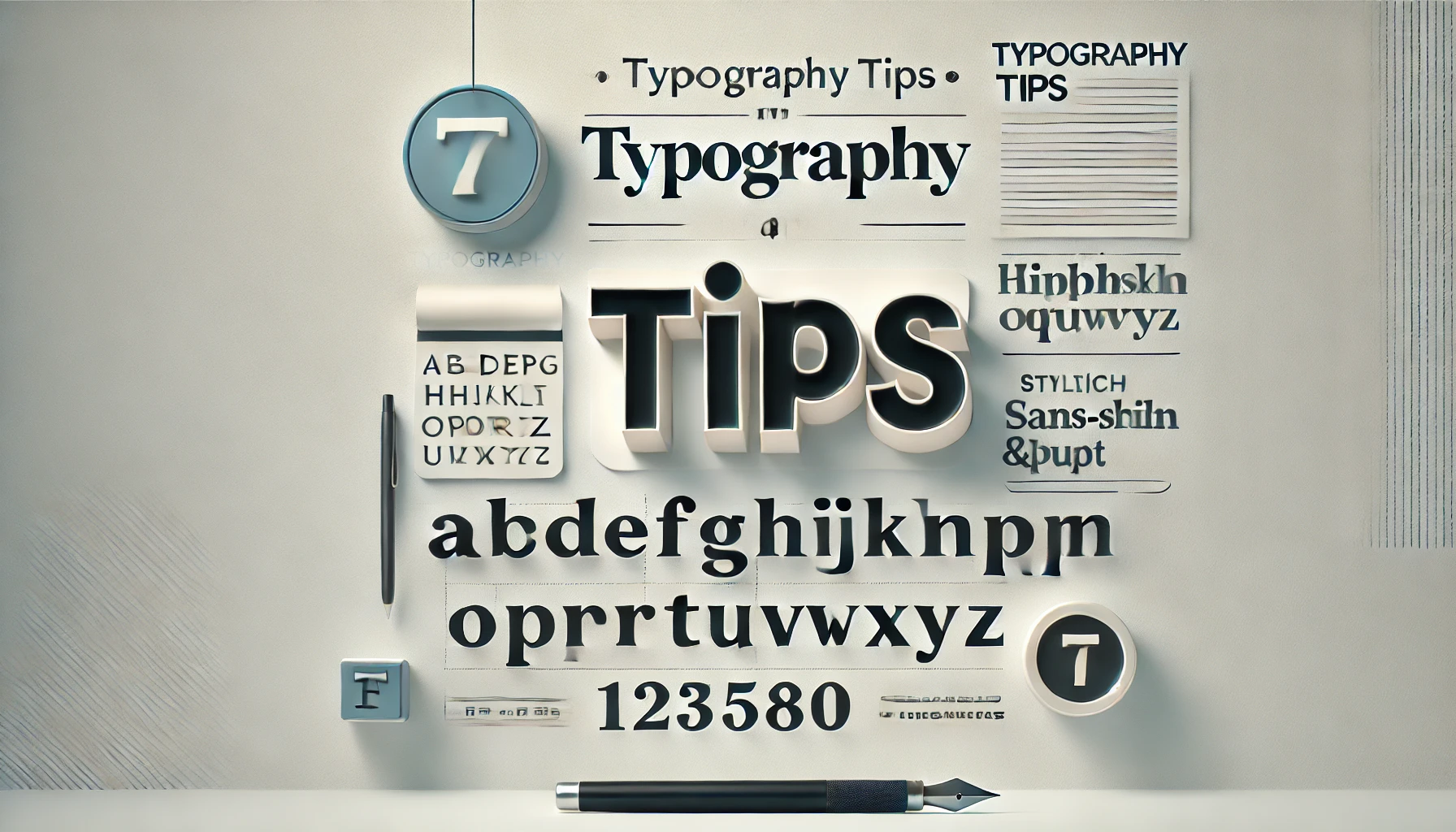
Choosing the Right Fonts: A Step-by-Step Guide
Selecting the perfect fonts for your brand is a critical step. It’s not just about picking something you like. It’s about choosing fonts that align with your brand’s values and target audience.
1. Define Your Brand Personality
Before you start browsing font libraries, take a step back and define your brand personality.
- What are your brand’s core values? (e.g., trustworthy, innovative, playful)
- What is your brand’s tone of voice? (e.g., formal, casual, humorous)
- Who is your target audience? (e.g., young professionals, families, creatives)
Understanding these elements will help you narrow down your font choices.
2. Explore Different Font Categories
Fonts are generally categorized into several main types:
- Serif: These fonts have small decorative strokes called serifs at the end of each letter. They are often associated with tradition, authority, and elegance. Examples include Times New Roman, Garamond, and Georgia.
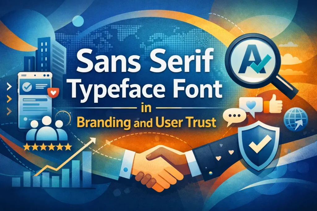
- Sans-Serif: These fonts lack serifs and have a cleaner, more modern look. They are often perceived as friendly, approachable, and minimalist. Examples include Arial, Helvetica, and Open Sans.
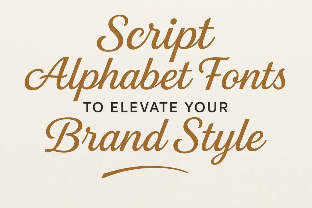
- Script: These fonts resemble handwriting and can add a touch of elegance, personality, or whimsy. However, they can be difficult to read in large blocks of text. Examples include Brush Script, Lobster, and Pacifico.
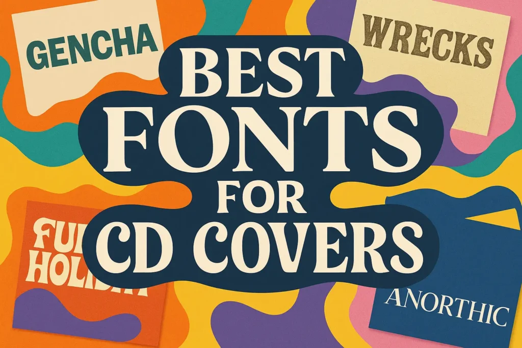
- Display: These fonts are designed for headlines and titles and are often more decorative and attention-grabbing. Examples include Impact, Bebas Neue, and Oswald.
3. Consider Readability and Legibility
While aesthetics are important, readability and legibility are crucial.
- Readability refers to how easy it is to read blocks of text. Choose fonts with good spacing and clear letterforms.
- Legibility refers to how easy it is to distinguish individual letters. Avoid fonts with overly complex or decorative letterforms, especially for body text.
4. Test Your Font Choices
Before committing to a font, test it in different contexts.
- Use it in headlines, body text, and call-to-actions.
- View it on different devices and screen sizes.
- Get feedback from others.
This will help you ensure that your chosen font works well across all your brand materials.
5. Font Pairing: Finding the Perfect Match
Often, you’ll need to pair two or more fonts together to create a balanced and visually appealing design. Here are some tips for successful font pairing:
- Contrast is key: Choose fonts that are different enough to create visual interest but still complement each other.
- Consider hierarchy: Use different fonts for headlines and body text to create a clear visual hierarchy.
- Limit your choices: Avoid using too many different fonts, as this can make your design look cluttered and confusing. Two or three fonts are usually sufficient.
- Use online tools: Several online tools can help you find complementary fonts.
Implementing Typography Across Your Brand
Once you’ve chosen your fonts, it’s time to implement them consistently across all your brand materials.
1. Create a Typography Style Guide
A typography style guide is a document that outlines how your brand’s fonts should be used. This ensures consistency and helps maintain a cohesive brand identity.
Your style guide should include:
- Primary and secondary fonts: Specify which fonts should be used for headlines, body text, and other elements.
- Font sizes and weights: Define the appropriate font sizes and weights for different contexts.
- Letter spacing and line height: Specify the preferred letter spacing and line height for optimal readability.
- Color palette: Indicate which colors should be used for text.
- Examples: Provide examples of how the fonts should be used in different applications.
2. Use Typography Consistently
Consistency is key to building a strong brand identity. Use your chosen fonts consistently across all your brand materials, including:
- Logo: Your logo should incorporate your chosen fonts.
- Website: Use your fonts throughout your website, including headlines, body text, and navigation menus.
- Marketing materials: Use your fonts in brochures, flyers, posters, and other marketing materials.
- Social media: Use your fonts in social media graphics and captions.
- Email marketing: Use your fonts in email newsletters and marketing emails.
3. Adapt Typography for Different Platforms
While consistency is important, you may need to adapt your typography for different platforms. For example, you may need to use smaller font sizes on mobile devices or choose different fonts for print versus digital media.
4. Stay Up-to-Date with Typography Trends
Typography is constantly evolving. Stay up-to-date with the latest trends and experiment with new fonts to keep your brand looking fresh and modern. However, avoid chasing every trend. Focus on choosing fonts that align with your brand’s values and will stand the test of time.
Examples of Brands with Strong Typography
Let’s take a look at some brands that have successfully used typography to create a unique brand voice:
- Coca-Cola: Their Spencerian script font is iconic and instantly recognizable, evoking a sense of nostalgia and tradition.
- Apple: Their use of clean, minimalist sans-serif fonts like San Francisco reflects their brand’s focus on simplicity and innovation.
- The New York Times: Their use of classic serif fonts like Times New Roman conveys a sense of authority and credibility.
- Mailchimp: Their playful and friendly sans-serif font, Cooper Light, reflects their brand’s approachable and humorous personality.
By studying these examples, you can gain inspiration for your own typography choices.
Choosing Fonts For Your Brand
1. Domina – Display Serif Font
Grogie – Modern Serif Font
Conclusion
Mastering how to use typography to create a unique brand voice isn’t just about aesthetics. It’s a strategic investment in your brand’s identity and recognition. By understanding the power of fonts, defining your brand personality, and implementing typography consistently, you can craft a visual language that resonates with your audience and sets you apart from the competition.
What are your favorite fonts for branding? Share your experiences and tips in the comments below!
FAQ
Q: How many fonts should I use for my brand?
A: Generally, it’s best to stick to two or three fonts: one for headlines and one for body text. Using too many fonts can make your design look cluttered and confusing.
Q: What is the difference between a typeface and a font?
A: A typeface is a family of fonts (e.g., Helvetica), while a font is a specific variation within that family (e.g., Helvetica Bold, Helvetica Italic).
Q: How do I know if a font is licensed for commercial use?
A: Check the font’s licensing information on the font provider’s website. Some fonts are free for personal use but require a commercial license for business purposes. Always ensure you have the proper license before using a font in your branding materials.


Leave a Comment