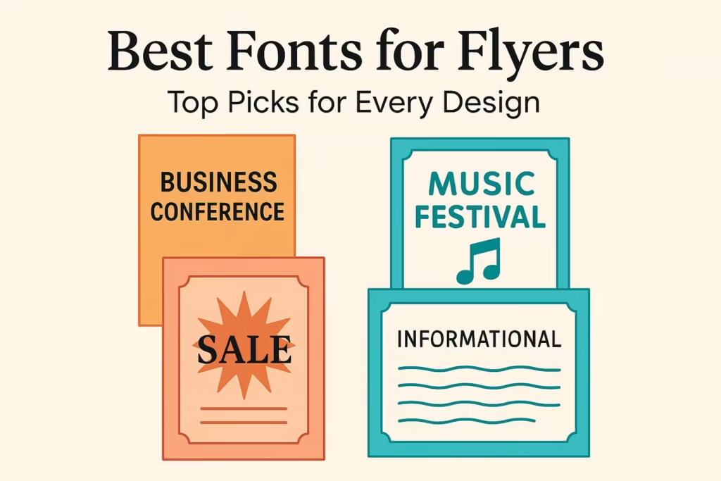
Choosing Fonts for Flyers: It’s a Bigger Deal Than You Think
Best fonts for flyers. Let’s be real making a flyer without thinking about the font is like baking a cake and forgetting the frosting. Sure, it might technically work, but it won’t catch anyone’s eye. Fonts aren’t just letters; they’re your flyer’s first impression. Whether you’re hyping up a garage sale or promoting your next big concert, picking the best fonts for flyers can be the difference between “Oooh, interesting!” and “meh, next.”
Fonts help you set the vibe, grab attention in a sea of scrolls and posters, and make sure your message sticks. In this article, we’ll walk you through a hand-picked list of the best fonts for flyers, depending on your flyer style—fun, formal, funky, or fierce. Plus, we’ve got some no-nonsense design tips to keep things looking sharp, not sloppy. Let’s dive in before Comic Sans sneaks in where it doesn’t belong!
How to Choose the Right Fonts for Your Flyer (Without Making People Squint)
Designing a flyer? Great! But hold your horses before you throw in that fancy swirly font that looks like it came from a wizard’s diary. If you want your flyer to actually be read, not just admired from a distance like abstract art, then choosing the right fonts is mission critical.
Here are some not-boring tips to help you pick readable flyer fonts that get the message across — without causing an eye strain epidemic.
1. Two Fonts Max, People. Seriously.
We get it. Fonts are fun. But using five different ones on a single flyer is like wearing leopard print, stripes, and polka dots at once. Pick one font for your headline, one for your body text. That’s it. Keep it clean, classy, and not like a ransom note.
2. Headline = Grabby. Body Text = Easy Peasy.
Your headline should turn heads faster than free pizza. Go bold, go eye-catching. But when it comes to the body text, go with something easy to read. The point is for people to actually read your flyer, not decode it like ancient hieroglyphs.
3. Choose Fonts That Match the Vibe
Are you promoting a kids’ art class? A metal concert? A luxury spa? Choose fonts that make sense for your theme and audience. Using Comic Sans for a law firm flyer? That’s a crime (maybe not legally, but still).
4. Readable Flyer Fonts Are Your Besties
No matter how “cool” that cursive font looks, if people can’t read your flyer in 2 seconds flat, it’s going in the trash. Look for font yang cocok untuk flyer — ones that are clean, simple, and readable at a glance. Your message matters more than decorative curls.
5. Size & Contrast Matter (Get Your Mind Out of the Gutter)
Make sure your text is large enough to read from a distance and contrasts well with the background. Light text on light backgrounds or dark on dark? Big nope. Think: “Would Grandma be able to read this without glasses?”
6. Avoid Fancy Fonts for Long Paragraphs
Script or decorative fonts have their moment — like a cute heading or a short quote. But use them for a full paragraph and your readers will start seeing double. Stick to plain, readable fonts for the bulk of your text. Trust us. Your audience (and their eyeballs) will thank you.
And there you go! Keep these flyer font tips in mind, and you’ll create a flyer that’s not only stylish but also super easy to read. Because nothing says “I’m a professional” like knowing when to say no to Curlz MT.
Want font recommendations? Keep scrolling, we’ve got you covered!
Best Fonts for Corporate Flyers (That Won’t Make Your Boss Cry)
So, your boss just asked you to make a corporate flyer. Cue the dramatic music.
You want it to scream professional, clean, and trustworthy — but not boring or 1997 PowerPoint vibes. The secret weapon? Fonts. Yep, those little letters carry serious weight.
Let’s not mess this up. Here are 5 fonts that’ll make your flyer look like it was designed by someone who drinks oat milk and understands margins.
1. Helvetica Neue – The Cool, Clean Overachiever
Looks like: That one coworker who’s always on time and wears the same sleek outfit every day.
This font is super clean, neutral, and works everywhere. It doesn’t scream for attention — and that’s kind of the point. If your flyer needs to say, “Trust us, we know what we’re doing,” this font is your new best friend.
2. Garamond – Classy Without Being Snobby
Looks like: A Shakespearean actor with a LinkedIn profile.
Garamond is elegant and timeless, kind of like a really expensive pen. It gives your flyer a bit of sophistication without being too old-school. Ideal if you’re selling luxury services or want to look extra distinguished.
3. Lato – Sleek, Modern, and Chill
Looks like: The intern who knows how to use Slack and fix the printer.
Lato is minimalist and modern but still super readable. It’s perfect if you want your flyer to look clean, fresh, and slightly tech-savvy. Basically, it says “we’re hip, but we mean business.”
4. Baskerville – Fancy, Formal, and a Bit Fancy Again
Looks like: The font equivalent of a business suit with cufflinks.
Baskerville is a classic serif font that gives off serious “We’re professionals and we love charts” energy. Great for finance, law, or any flyer that needs a splash of authority with style.
5. Myriad Pro – The Swiss Army Knife of Fonts
Looks like: A font that can handle a meeting, a logo, and a TED Talk.
Myriad Pro is super versatile — clean, readable, and a little more friendly than Helvetica. It plays well with both print and digital designs, so your flyer will look good in inboxes and on bulletin boards.
Final Pro Tip:
Don’t mix all these fonts in one flyer unless you want to give your reader a mild headache. Stick to one (maybe two) and let the message — and your awesome font choice — do the heavy lifting.
Fly forth and design responsibly!
Best Fonts for Event or Party Flyers (a.k.a. How to Make People Actually Notice Your Poster)
Alright, party people and design dabblers—listen up!
If you’re making a flyer for your big event (concert, birthday bash, underground origami tournament… whatever), there’s one thing you must get right: the font.
Yep. Not the snacks. Not even the playlist. It’s the font.
Because if your text looks boring, no one’s showing up—except maybe your mom. And she’ll probably bring her cat. So, let’s keep it bold, expressive, and creative!
Here are the fonts that’ll make your flyer scream (in a good way):
Monument Extended Font
Big. Bold. Basically yelling, but with class.
This font is wide, loud, and impossible to ignore—like that one friend who always shows up in neon. Monument Extended is perfect if you want your event to say:
“LOOK AT ME!”
Use it for headlines, titles, or anything that needs to slap people in the face (visually, of course).
Akira Expanded Font
For concerts, artsy stuff, and when you want to look “cool without trying too hard.”
Akira Expanded has this edgy, futuristic vibe. If your event involves loud music, edgy art, or anything with glow sticks, this is your font. It’s like the leather jacket of typefaces.
Lobster Font
Script font, but make it warm and fuzzy.
Lobster is that friendly font that feels like a cozy cafe hug. It’s great for events like local markets, chill get-togethers, or anything involving cookies. It’s got that handwritten charm without looking like your doctor’s signature.
Bebas Neue Font
All caps. All attitude. All-purpose.
This font is clean, bold, and ready to work. It’s perfect for almost any kind of flyer: fitness bootcamps, tech meetups, fashion shows—you name it. Bebas Neue is the reliable friend that shows up on time and still looks cool.
Pacifico Font
Casual, handwritten, and just a little flirty.
Planning a beach party? Backyard BBQ? “Accidentally” viral indie gig? Pacifico is your go-to. It looks like it was scribbled by someone on vacation and we love that for it. Easy-going, fun, and full of personality.
A good flyer needs a good font. Not just any font—a personality-packed one. Whether you’re going for bold, artsy, cozy, strong, or chill, there’s a font for that.
So stop using Times New Roman (we see you), and give your flyer the love it deserves.
Your party isn’t boring—don’t let your font be either.
Best Fonts for Promotional/Sales Flyers
When you’re crafting a flyer to shout “Hey, buy this NOW!”, your font game needs to be strong. You want your message loud and clear—and make people feel like they need it yesterday. So, what fonts do the job? Think big, bold, and oh-so-readable.
1. Impact Font – Short, punchy, punch-in-the-face strong
Seriously, it sounds like it hits hard, and it does. Use this for ultra-short headlines like “SALE!”, “TODAY ONLY!”, or “BOGO FREE!”. It’s like that friend who yells from across the room—but in a good, business-growth kinda way.
2. Anton Font – The “bold discount” display king
Anton is like Impact’s cooler, chiller cousin who still lifts weights. Perfect for “50% OFF!”, “END OF SEASON BLOWOUT!”, you name it. It’s big, it’s bold, and it refuses to be ignored.
3. Roboto Condensed Font – Space-saving superstar
Got walls of text? Roboto Condensed slides in, squeezing lots of info into tight spaces without turning your flyer into a blur of letters. It reads like a dream, even if it’s tight on real estate.
4. Oswald Font – Modern, slim, sleek
Want modern vibes without sacrificing legibility? Oswald is your font soulmate. It’s sharp, stylish, and plays well anywhere: headers, subheads, or punchy bullet points.
5. Pricedown Font – Retro flair for those bold headlines
Feeling nostalgic? Pricedown brings that vintage arcade-game energy to your flyer. Think “NEW ARRIVAL!” or “LIMITED EDITION!” headlines with a zing of old-school pizzazz.
Quick Font Pairing Tips
- Headline (bold, MEGA visible) + Body (clean sans-serif) is your secret sauce.
Example combo: Anton for your “FLASH SALE!” and Roboto Condensed for the details like “Ends tonight at midnight—don’t miss out!” - Go for contrast: heavy, chunky fonts upfront, light-to-medium fonts for the rest. Keeps the eye interest high!
- Don’t overload the fonts. Stick to two fonts max—you get messy, you confuse the brain.
Sample Pairings for Flyers
| Use Case | Headline Font | Body Font |
|---|---|---|
| Mega Sale Alert | Impact | Roboto Condensed |
| Discount Blast | Anton | Oswald |
| Stylish Product Ad | Oswald | Roboto Condensed |
| Retro Promo | Pricedown | Roboto Condensed |
Choose a font that yells your message without making folks squint. Big, bold headlines (Impact, Anton, Pricedown) grab attention. Sleek, readable fonts (Roboto Condensed, Oswald) keep the details digestible. Nail your headline/body pairing, and your flyer will pull eyes—and wallets—in no time.
Happy flyer crafting—and may your sales soar!
Best Fonts for Informational/Educational Flyers
(Because Comic Sans is not invited to this party)
So, you’re making an educational flyer — maybe about climate change, algebra tips, or how not to microwave metal (important stuff!). Whatever the topic, you need one thing for sure: a font that’s actually readable. We’re not designing a wedding invitation here; this is all about clarity, structure, and getting your info across without making people squint.
Let’s talk fonts — not the dramatic kind, but the kind that’ll make your flyer look smart, professional, and still friendly enough that people actually read it.
1. Merriweather Font – The Cozy Chair of Serif Fonts
If your flyer has a lot of text (think: “the more you read, the smarter you get” vibe), Merriweather is your best friend. It’s a serif font — yes, the one with little “feet” at the end of letters — and it’s designed for comfortable reading.
It’s like a cup of warm tea for your eyes. Readers can cruise through long paragraphs without getting that “my brain hurts” feeling. Bonus: it works great both in print and on screen!
2. Open Sans Font – The Switzerland of Fonts
Open Sans is clean. It’s neutral. It doesn’t scream “look at me!” — and that’s exactly why it’s awesome. When you want your information to shine (not the font), this one’s a winner.
It keeps things simple and super legible, even when you have bullet points, side notes, and random facts everywhere. Basically, it’s the grown-up, responsible font that gets the job done.
3. Source Serif Pro Font – Free, Friendly, and Fabulous
Want a serif font that’s stylish and free? Source Serif Pro has your back. It’s an open-source font, which means it’s free to use and loved by designers who don’t want to sell their kidneys for licensing fees.
It looks smart, academic, but not too stiff. Perfect for flyers that are trying to say, “Hey, we’re educational — but cool about it.”
4. Inter Font – Built for Screens, Loved by All
Let’s say your flyer is going digital — maybe in a PDF, email, or posted on the school’s website. Enter: Inter. This font was literally made for screens. It’s modern, crisp, and easy to read even if someone’s using their phone in dark mode at 2 AM.
Plus, it just looks sleek. Your flyer will instantly feel like it’s from 2025, not 2005.
5. PT Sans Font – Clear, Calm, and Classy
Last but not least, PT Sans is like the favorite teacher who explains things so well, you actually understand math. It’s clear, it’s calm, and it handles educational content beautifully.
It’s great for brochures and flyers with short paragraphs and structured sections. Think: bold headlines, tidy body text, and maybe a few fun facts thrown in.
Final Tip: Pair It Like a Pro
Sometimes, two fonts are better than one. Try using a serif font (like Merriweather or Source Serif Pro) for body text, and a sans-serif (like Open Sans or Inter) for titles and headings. It adds contrast and makes your flyer look designed by someone who totally knows what they’re doing — even if you just picked it randomly and hoped for the best.
Font Pairing Guide for Flyers
Alright, so you’re designing a flyer. You’ve picked a catchy title, got some spicy content, and now it’s time to slap on some fonts. But hold up! You can’t just throw Comic Sans and Times New Roman together and hope for the best. That’s font chaos, my friend. Let’s talk about font pairing — the art of matching fonts so they look like they belong together, like peanut butter and jelly or Netflix and snacks.
A Few Killer Font Combos
Here are some font duos that are practically BFFs:
- Merriweather + Roboto
- Merriweather brings that classy, serif vibe. It’s great for headlines that want to look smart and important. Roboto, on the other hand, is clean, modern, and super readable. Use it for your body text and boom — you’ve got a sleek, professional look.
- Playfair Display + Lato
- Playfair Display is like the elegant cousin who shows up to brunch in a designer coat. It makes a gorgeous headline. Lato balances things out with a friendly and neutral tone. This pair is perfect when you want your flyer to scream “stylish but approachable.”
- Montserrat + Open Sans
- Montserrat is bold, geometric, and ready to party. It grabs attention as a headline font. Open Sans is like the reliable friend who makes sure everyone gets home safe. This combo is energetic but easy to read — perfect for event flyers or modern promotions.
Tips for Choosing Your Font Soulmates
Picking fonts is kind of like dating. You want contrast, but not too much contrast. Harmony, but not boring. Here are a few tips to avoid a font disaster:
- Contrast is good: Pair a bold display font with a simple sans-serif. The difference makes your flyer pop.
- Stay in the same vibe: Don’t pair a medieval-style font with a futuristic one unless you’re advertising a time machine.
- Limit it to two: Three fonts max, or you risk making your flyer look like a ransom note.
- Test readability: Your flyer should look cool, but people still need to read it. Make sure the fonts work well in different sizes.
So next time you’re working on a flyer, don’t just pick fonts like you’re closing your eyes and clicking randomly. Be intentional, be stylish, and most importantly — make those fonts get along like a dream team!
Now go forth and pair wisely!
Wrapping It Up: Fonts Don’t Just Talk, They Scream (If You Pick the Right One)
Choosing the right font for your flyer isn’t just about picking something that looks “fancy” — it’s about making your message sing, shout, or politely wave depending on who you’re talking to. Whether you’re inviting people to a rooftop party, promoting a big sale, or explaining why your tech startup is the next big thing, your font says it before your words do.
From clean and classy fonts like Helvetica for your serious “we mean business” vibes, to loud-and-proud choices like Impact or Akira Expanded for those “LOOK AT THIS AWESOME THING” flyers — there’s a font out there for every kind of message.
Remember:
- Match your font with your flyer’s goal like you match your shoes to your outfit.
- Don’t overdo it. No one wants to read a flyer that looks like a ransom note.
- And please, for the love of design, never stretch fonts horizontally. They have feelings too.
So go ahead — mix, match, preview, and have fun with it! Your flyer deserves to stand out, and the right font is like the perfect pickup line: it gets attention and (hopefully) doesn’t make anyone cringe.
Happy designing — and may your kerning always be tight.
FAQ: Font Flyer
What is the best font size for flyers?
The best font size for flyers depends on the type of content and how far it needs to be read. For headlines, go bold with at least 24–36pt to grab attention, while body text should be around 10–14pt for readability. Remember, the best fonts for flyers are useless if people need a magnifying glass to read them!
Can I use cursive or script fonts on a flyer?
Yes, but sparingly! Script fonts can add elegance or flair to your flyer, especially for events or personal brands, but they should never be used for long paragraphs. The best flyer fonts balance style and clarity — script is best kept for headlines or accents, not the fine print.
How many fonts should I use in one flyer?
Stick to 2 fonts max: one for the headline, one for the body. Maybe a third if you’re feeling wild — but don’t overdo it! The best flyer font combinations are clean, consistent, and easy on the eyes, not a chaotic font party.
Are serif or sans-serif fonts better for flyers?
Both can be great, depending on the style and purpose of your flyer. Serif fonts give a classic, trustworthy vibe — ideal for corporate or informational flyers. Sans-serif fonts feel modern and crisp, making them some of the best fonts for event or promotional flyers. Pick what fits your message best!


Leave a Comment