Best CV fonts. Choosing the right font for your CV can make all the difference in leaving a lasting impression. Whether you’re a fresh graduate or an experienced professional, the font you use can say a lot about your attention to detail, professionalism, and design sense. In this article, we will explore the best CV fonts that not only enhance the readability of your resume but also give it a modern, polished look. A well-chosen font can help your CV stand out among a pile of applications. So, let’s dive into the best fonts for CVs that will help you create an eye-catching and professional resume!
15 Best CV Fonts to Make Your Resume Stand Out

Here is a list of the best CV fonts that are perfect for creating a clean, professional, and attractive resume. Each font has its unique characteristics, and choosing the right one depends on the style and tone you want to convey.
- Arial
Arial is a classic sans serif font that is simple and highly readable. It’s a safe choice for any resume as it is universally used and looks professional without being too flashy. Arial gives your CV a clean, modern touch. - Helvetica
Known for its crisp, clear lines, Helvetica is one of the most popular fonts for resumes. It provides excellent readability and has a timeless, professional feel. - Times New Roman
A traditional serif font, Times New Roman is often the default choice for resumes. While it’s slightly more formal, it still has a professional, polished look and works well for industries that value formality, like law or finance. - Calibri
Calibri is a modern sans-serif font that’s easy on the eyes. It has a subtle, rounded appearance that’s perfect for creating a contemporary and approachable look on your CV. - Georgia
Georgia is a serif font that gives your CV a traditional, yet refined, look. Its larger letter spacing makes it easy to read, even at smaller sizes, which is ideal for resumes that need to fit a lot of information. - Verdana
Verdana is another sans-serif font that’s great for readability on both digital and print versions of your CV. It’s slightly wider than other fonts, which makes it an excellent option for resumes with smaller margins. - Garamond
If you want to add a touch of elegance to your resume, Garamond is a great option. This serif font is stylish and sophisticated without being too formal, making it a popular choice for creative professionals. - Cambria
Cambria is a serif font that was designed specifically for reading on screens. Its clean design and excellent legibility make it perfect for resumes that will be read online or printed. - Roboto
Roboto is a popular modern sans-serif font known for its versatility. It has a geometric yet friendly look, and it works well in both headings and body text. - Montserrat
Montserrat is a trendy sans-serif font that gives a modern, stylish feel to your resume. It’s perfect if you’re looking for a font that stands out and grabs attention, while still being readable. - Lato
Lato is a sans-serif font that provides excellent readability with a modern design. Its smooth, rounded appearance gives your CV a clean and approachable look without sacrificing professionalism. - Baskerville
A serif font with a distinguished, elegant design, Baskerville is great for CVs that need to project an air of sophistication. It’s ideal for those in academia, writing, or research fields. - Avenir
Avenir is a geometric sans-serif font with a contemporary look. It’s clean, stylish, and works well for those who want their resume to feel modern without being too bold. - Futura
Futura is another geometric sans-serif font that looks sharp and modern. It’s excellent for creating a CV with a minimalist, sleek appearance while maintaining readability. - Source Sans Pro
Source Sans Pro is a professional, sans-serif font with a clean, open design. It’s perfect for creating a simple yet highly legible CV, making it ideal for professionals in technical fields.
Why the Right CV Font Matters
When applying for a job, your CV is often the first thing a hiring manager sees. The font you choose is part of the first impression you make. A well-chosen font helps your CV look organized and easy to read, ensuring that important details stand out. On the other hand, using the wrong font could make your CV appear cluttered or unprofessional, leading to a negative first impression.
Legibility
The primary reason to choose a specific font for your CV is readability. A font that’s hard to read can confuse the hiring manager or make them give up on your CV before finishing it. Fonts like Arial, Calibri, and Helvetica are well-known for their legibility, even at smaller sizes.
Professionalism
Different fonts convey different tones. Fonts like Times New Roman and Garamond are more traditional and formal, while fonts like Montserrat or Roboto give a more modern, stylish vibe. Choosing the right font can help communicate the type of role or industry you’re applying for—whether it’s a corporate job, a creative role, or a tech position.
Branding Yourself
Your CV should reflect who you are as a professional. A creative individual might want to opt for a modern, sleek font like Futura, while someone working in finance might lean towards something more formal like Times New Roman. The font can play a role in subtly conveying your personal brand.
Key Tips for Using the Best CV Fonts
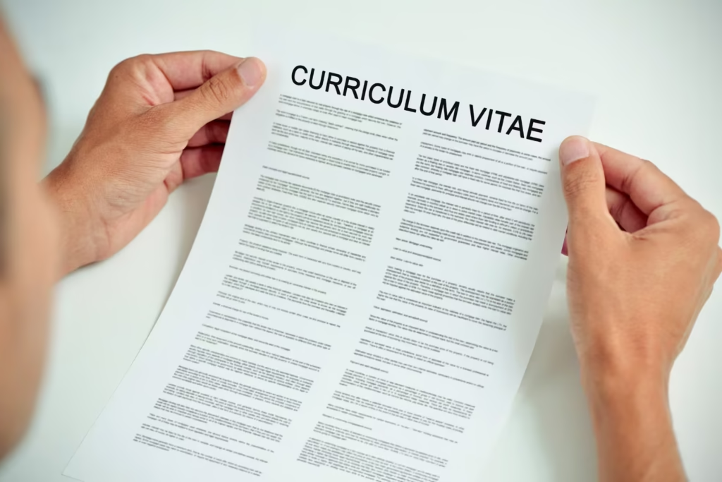
While choosing the right font is important, here are some additional tips to ensure your CV looks as professional as possible:
- Keep It Simple
Avoid using more than two fonts in your CV. Using a combination of fonts can create visual clutter. A good rule of thumb is to choose one font for the body text and another for headings. - Font Size Matters
Use a font size between 10 and 12 points for body text. This ensures your CV is readable while still fitting on one or two pages. Headings can be slightly larger, around 14-16 points. - Use Bold and Italics Wisely
Bold and italics are useful for emphasizing key points, such as job titles or company names. However, overusing these can make your CV look chaotic. Use them sparingly and strategically. - Avoid Using Too Many Styles
Don’t use underlined text or excessive italicization, as these can make your CV look unprofessional. Stick with bold or regular styles to maintain a clean, simple layout. - Ensure Consistency
Consistency is key to creating a professional CV. Ensure the same font, size, and style are used throughout your document for a uniform look.
How to Choose the Best CV Font for Your Industry
The font you choose should align with the industry you’re targeting. Here’s a quick guide on choosing the right font based on your field:
- Creative Fields (e.g., Graphic Design, Marketing): Opt for modern, clean fonts like Montserrat, Avenir, or Futura. These fonts make your CV stand out while maintaining readability.
- Corporate Jobs (e.g., Finance, Law): Traditional fonts like Times New Roman, Helvetica, and Garamond are great choices. These fonts give your CV a professional, serious tone.
- Tech & Engineering: Fonts like Roboto, Source Sans Pro, or Calibri are ideal. They have a modern, sleek appearance that works well in the tech space.
- Academia: Serif fonts like Georgia, Baskerville, and Cambria are commonly used in academic resumes, as they have a traditional, polished feel.
Conclusion
Choosing the best CV fonts is an essential step in crafting a resume that leaves a lasting impression. The font you choose should reflect your personality, industry, and professionalism while making your CV easy to read. Fonts like Arial, Helvetica, and Calibri are safe choices, while more unique fonts like Montserrat and Futura can make your resume stand out. Remember to keep your CV clean, simple, and consistent to ensure the best results.
By selecting the right font for your resume, you can enhance your chances of landing that dream job. So, take the time to choose wisely, and make sure your CV represents you in the best possible light!
FAQ: Best CV Fonts
What is the best font for a CV?
The best font for a CV is one that is readable, professional, and appropriate for the job you’re applying for. Popular choices include Arial, Helvetica, and Calibri.
Can I use creative fonts on my CV?
Yes, creative fonts like Montserrat and Futura are great for creative industries, but ensure the font is still legible and professional.
Should I use serif or sans-serif fonts for my CV?
Both serif and sans-serif fonts are suitable for CVs. Serif fonts like Times New Roman give a formal feel, while sans-serif fonts like Arial and Calibri are modern and clean.
How many fonts should I use on my CV?
Stick to one or two fonts to avoid clutter. Use one font for the body text and another for headings or section titles.
Is it important to choose the right font size for my CV?
Yes, the font size should be between 10 and 12 points for body text to ensure readability. Headings can be slightly larger, between 14 and 16 points.
Can the font I use impact my chances of getting hired?
Yes, using a professional and readable font can improve the overall presentation of your CV, making it more likely to be noticed by hiring managers.




Leave a Comment