
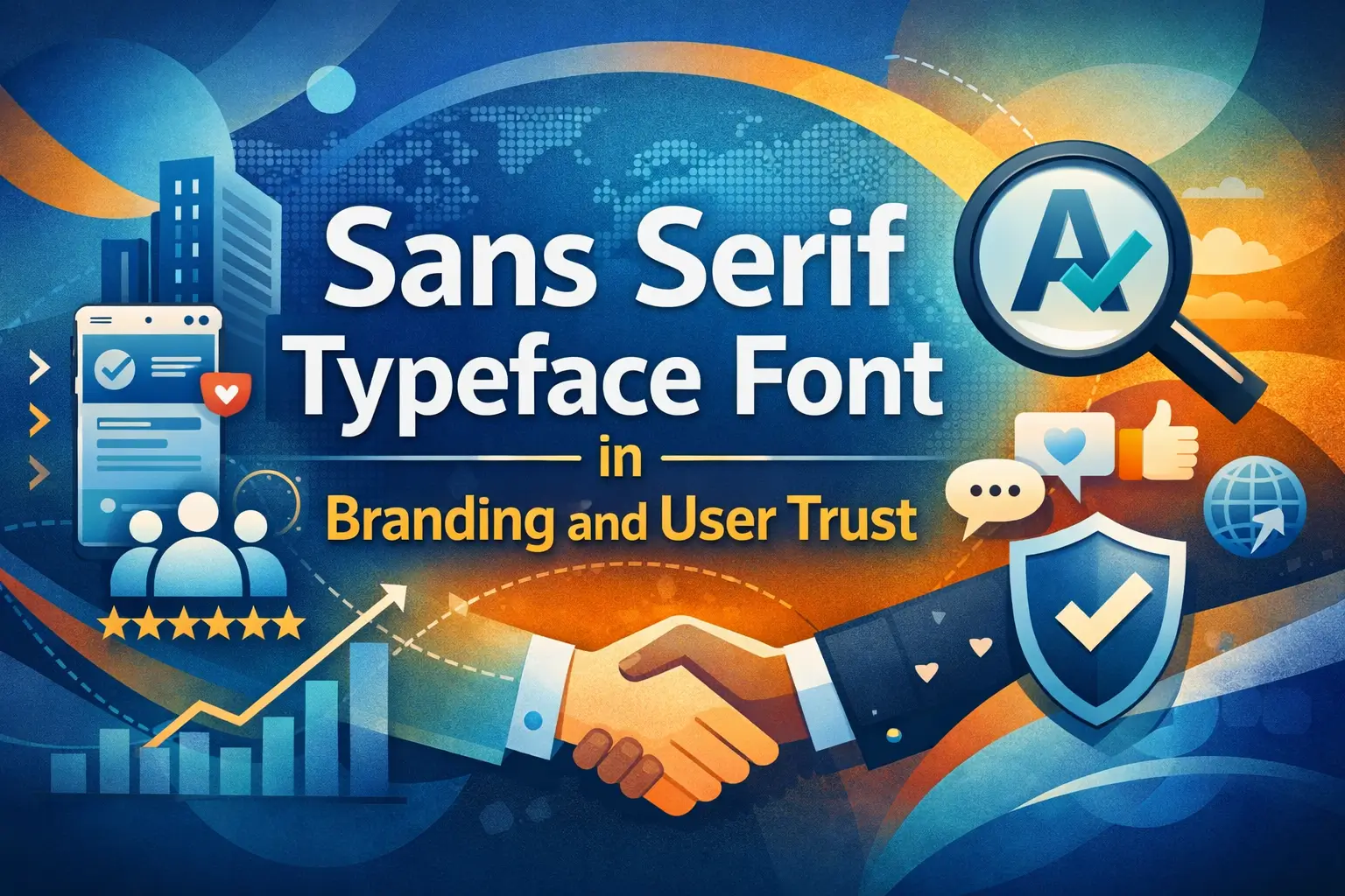
Sans Serif Typeface Font and the Way We Read Today
Sans Serif Typeface Font. Why do so many websites feel effortless to read, even before you focus on the message?
The answer is often hidden in plain sight.
The sans serif typeface font has become the dominant visual language of the internet. From mobile apps to global brand identities, this font style quietly influences how we read, feel, and trust content.
In this article, you will understand:
- Why sans serif typeface font dominates digital communication
- How it impacts user experience, perception, and readability
- Why brands and publishers consistently rely on it
This is not a tutorial. It is a deep look into how typography shapes modern behavior and decision making.
Read More : 25+ Best Fonts for CD Covers to Elevate Your Album Design
What Defines a Sans Serif Typeface Font
The Core Meaning Explained Simply
A sans serif typeface font is a font that does not include decorative strokes at the ends of letters.
In practical terms:
- Sans means without
- Serif refers to small finishing details
The result is a font that looks clean, neutral, and visually efficient.
Visual Traits That Matter
Common characteristics include:
- Even stroke thickness
- Open letterforms
- Minimal visual noise
- Strong clarity at small sizes
These traits make sans serif fonts especially effective on screens and digital interfaces.
Read More : Script Alphabet Fonts to Elevate Your Brand Style
Why Sans Serif Typeface Font Feels Modern
The Digital Reading Shift
In print media, serif fonts once dominated because they helped guide the eye across physical pages.
Digital screens changed that dynamic completely.
Research from Nielsen Norman Group shows that sans serif fonts perform better for online readability, particularly on mobile devices.
Reasons include:
- Better rendering on screens
- Clear shapes at different resolutions
- Reduced eye strain
This explains why digital platforms prefer sans serif typography almost universally.
Psychological Signals to the Reader
Sans serif typeface font often communicates:
- Simplicity
- Transparency
- Efficiency
- Modern thinking
Without readers realizing it, these signals shape trust and comfort while consuming content.
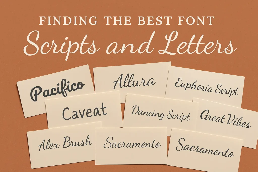
Read More : Finding the Best Font for Scripts and Letters
Sans Serif Typeface Font and Brand Perception
How Typography Builds Credibility
Typography is not neutral. It influences emotional response almost instantly.
Studies referenced by MIT AgeLab indicate that people form judgments about professionalism and trustworthiness within milliseconds of seeing text.
Sans serif fonts tend to score higher in:
- Perceived honesty
- Approachability
- Contemporary relevance
This is why technology brands and digital services favor them.
Real Brand Decisions
Many global brands simplified their typography to align with modern expectations. Their decisions were driven by clarity and consistency across devices, not trends.
When brands remove visual friction, users stay longer and engage more deeply.
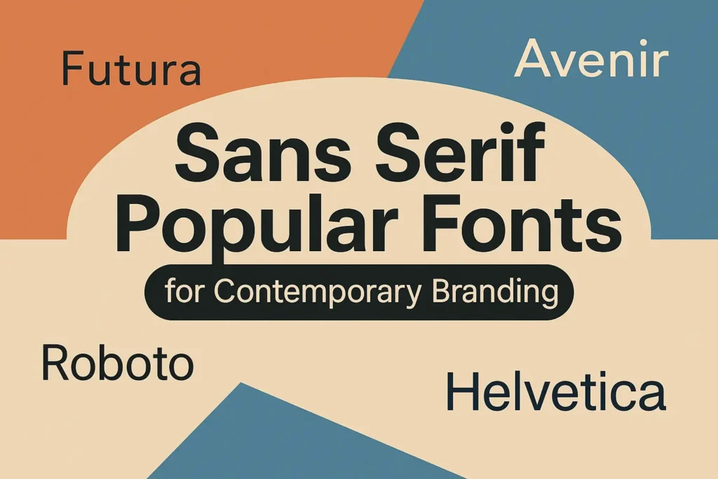
Read More : Sans Serif Popular Fonts for Contemporary Branding
Sans Serif Typeface Font in UX and Reading Patterns

Supporting Natural Eye Movement
Eye tracking research shows users scan content in predictable patterns, often called F patterns or Z patterns.
Sans serif fonts support these behaviors by:
- Maintaining consistent letter recognition
- Improving line flow
- Reducing cognitive load
This allows readers to absorb information faster and with less effort.
Accessibility and Inclusive Design
Sans serif typeface font is widely used in accessibility focused design.
Benefits include:
- Clear differentiation between similar characters
- Better readability for dyslexic users
- Strong performance for multilingual content
Accessibility is no longer optional. Typography plays a major role in inclusive experiences.
Read More : Best CV Fonts to Make Your Resume Stand Out
Types of Sans Serif Typeface Font You See Everywhere
Humanist Sans Serif
These fonts feel natural and friendly.
Key traits:
- Subtle stroke variation
- Inspired by handwriting
Commonly used in editorial platforms and education related content.
Geometric Sans Serif
These fonts are based on simple shapes.
Key traits:
- Strong symmetry
- Precise appearance
Often used by startups and technology brands that want a modern identity.
Neo Grotesque Sans Serif
These fonts are neutral and highly adaptable.
Key traits:
- Balanced proportions
- Minimal personality
Frequently used in corporate systems and large scale interfaces.
Read More : Preppy Fonts That Elevate Your Aesthetic Instantly
Sans Serif Typeface Font Compared to Serif Fonts
| Aspect | Sans Serif Typeface Font | Serif Typeface |
|---|---|---|
| Visual Style | Clean and modern | Traditional and formal |
| Screen Readability | High | Medium |
| Emotional Tone | Neutral and clear | Classic and authoritative |
| Best Usage | Digital content and UI | Print and books |
Read More : Discover Unique Aesthetic Fonts to Elevate Your Design Style
8 Best Sans Serif Typeface Font for Modern Creative Projects

Choosing the right sans serif typeface font is more than a visual decision. It defines how a brand speaks, how content feels, and how audiences perceive professionalism. Below is a curated selection of premium sans serif typeface fonts designed for branding, editorial work, digital products, and commercial design needs.
1. Hipo Font
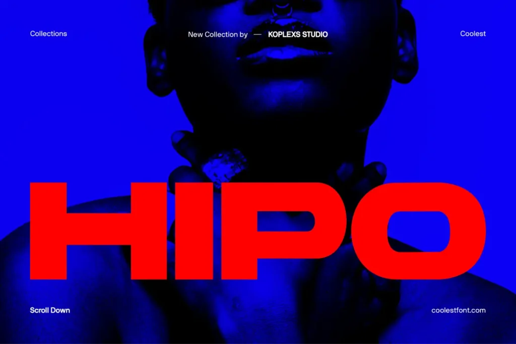
Hipo Font is a contemporary sans serif typeface font built with clean proportions and confident geometry. Its letterforms feel modern yet balanced, making it suitable for branding systems, user interfaces, and headline driven layouts. The font maintains clarity across different sizes, which allows designers to use it consistently from logos to long form content. Hipo works particularly well for brands that want to communicate precision, innovation, and reliability while keeping a friendly visual tone that invites engagement and exploration.
2. Bufs Font
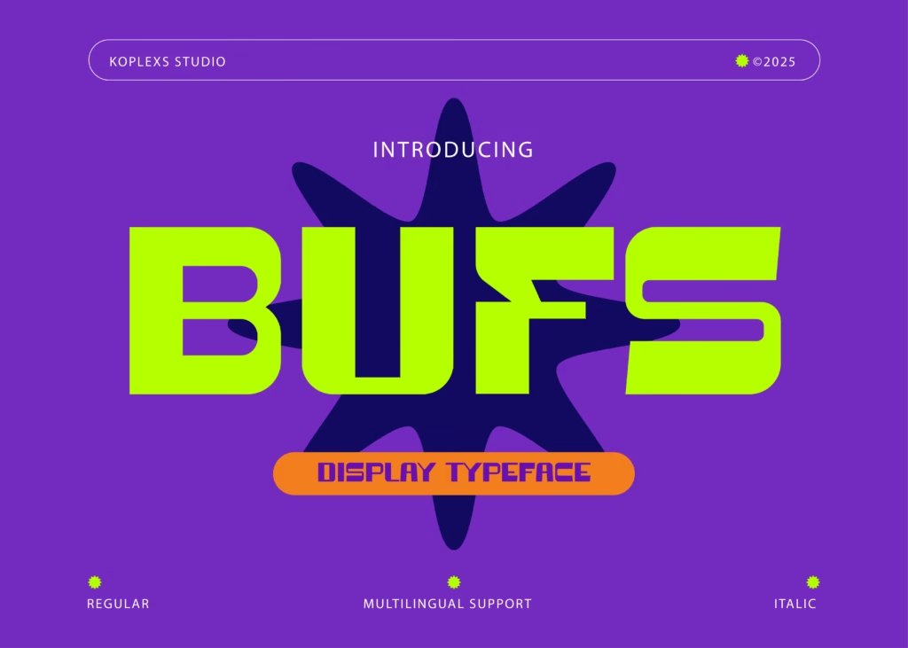
Bufs Font is a bold and expressive sans serif typeface font that emphasizes strong character and visual impact. Its structure feels assertive without becoming aggressive, making it ideal for posters, packaging, brand identities, and marketing materials. The font stands out in crowded visual environments and helps messages feel confident and memorable. Designers looking to create attention grabbing visuals will find Bufs effective for building presence and reinforcing brand recognition across multiple platforms.
Read More : Best Fonts for Logos That Make Your Brand Stand Out
3. Barytons Font
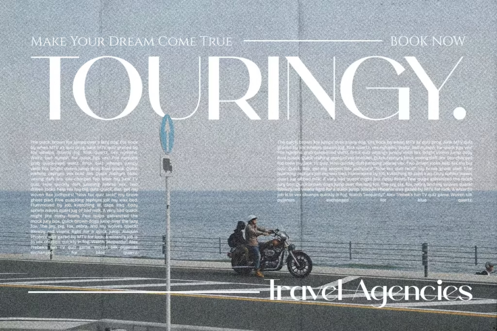
Barytons Font delivers a refined sans serif typeface font with a slightly condensed structure that feels elegant and controlled. It is well suited for editorial layouts, luxury branding, and sophisticated digital experiences. The font balances readability with personality, allowing text to feel premium without sacrificing clarity. Barytons supports projects that aim to communicate authority, style, and thoughtful design decisions while maintaining a modern typographic voice.
4. Gencha Font
Gencha Font is a versatile sans serif typeface font inspired by clean design principles and contemporary visual culture. Its smooth curves and well spaced letterforms make it comfortable to read, especially in digital environments. This font adapts easily to branding, web design, presentations, and social media visuals. Gencha is a strong option for creatives who need a flexible typeface that feels modern, calm, and approachable across different content formats.
5. Saloums Font

Saloums Font is a sans serif typeface font that blends softness with structure, creating a friendly and human centered appearance. It works well for lifestyle brands, creative studios, and projects that prioritize emotional connection. The font feels welcoming while still maintaining professional integrity, making it suitable for both headlines and body text. Saloums supports storytelling focused designs where tone and personality matter as much as readability.
Read More : Discover the Best Bubble Letter Font Styles for Creative Projects
6. Bourne Font

Bourne Font is a clean and functional sans serif typeface font designed for clarity and performance. Its neutral character makes it ideal for corporate branding, dashboards, applications, and large scale communication systems. The font delivers consistency across different devices and screen sizes, helping brands maintain a unified visual identity. Bourne is particularly effective for projects that demand efficiency, structure, and long term usability.
7. Backfarm Font

Backfarm Font introduces a modern sans serif typeface font with a subtle industrial feel. Its strong shapes and confident strokes give designs a grounded and authentic presence. This font is suitable for product branding, apparel design, and bold visual campaigns that require a sense of strength and originality. Backfarm helps creatives express bold ideas while keeping typography readable and adaptable.
Read More : Mastering Beautiful Calligraphy Alphabets for Beginners
8. Hypogea Font
Hypogea Font is a distinctive sans serif typeface font with architectural influences and a strong sense of form. Its letter construction feels intentional and structured, making it a great choice for creative branding, cultural projects, and design led products. Hypogea allows designers to create visual identities that feel intelligent, contemporary, and concept driven while still remaining accessible to broad audiences.
Choosing the Right Sans Serif Typeface Font
Each sans serif typeface font above offers a unique balance of clarity, personality, and usability. From bold and expressive styles to neutral and functional designs, these fonts support a wide range of creative and commercial needs. Selecting the right typeface depends on how you want your message to feel and how your audience should experience your brand. By aligning typography with purpose, these fonts become more than design assets. They become powerful communication tools that elevate visual identity and user experience.
Read More : Best Fonts for Flyers: Top Picks for Every Design
Professional Insight and Real Experience
According to a Forbes report on digital design trends, brands that simplified typography experienced higher engagement and stronger brand recall.
From direct experience working with content teams and UX designers, one pattern appears consistently:
When typography becomes clearer, content performs better.
This is not subjective. It reflects how the human brain processes visual information.
Tools and Resources Worth Using
If you want to explore or test sans serif typeface font performance, consider:
- Google Fonts for reliable web safe options
- Adobe Fonts for professional typography systems
- Figma for interface testing
- Type scale generators for hierarchy optimization
Disclaimer: Always test fonts across multiple devices and user conditions before final deployment.
Read More : Tattoo Font Styles: Best Fonts to Inspire Your Next Ink
Conclusion: Why Sans Serif Typeface Font Remains Essential
The dominance of the sans serif typeface font is not accidental. It aligns with how people read, scan, and trust information in digital environments.
Key takeaways:
- It improves clarity and accessibility
- It supports UX and SEO goals
- It strengthens modern brand perception
If your content lives online, typography is not decoration. It is strategy.
FAQ About Sans Serif Typeface Font
Why is sans serif typeface font preferred for digital content?
It renders more clearly on screens and reduces visual strain.
Is sans serif suitable for long articles?
Yes. With proper spacing and structure, it supports comfortable long form reading.
Does typography influence trust?
Yes. Clean fonts are often perceived as more transparent and professional.
Does sans serif typeface font help SEO?
Indirectly. Better readability leads to improved engagement signals.
Can sans serif fonts feel warm or emotional?
Yes. Humanist styles can feel approachable and friendly.


Leave a Comment