
Font Size for Accessibility. When it comes to inclusive web design, font size is one of the most underestimated yet crucial elements. Proper font sizing ensures that content is accessible, legible, and user-friendly for individuals of all ages and abilities. In the context of accessibility, font size isn’t merely about aesthetics—it’s about usability, compliance, and delivering equitable digital experiences.
In this comprehensive guide, we’ll dive deep into the best practices for font size in accessible design, supported by the latest research, design principles, and real-world examples.
Why Font Size Matters in Accessibility

Visual Impairments and Readability
Approximately 2.2 billion people worldwide live with some form of vision impairment. For many, small or irregular font sizes create significant barriers to accessing content.
Cognitive Load Reduction
Larger and well-structured fonts improve reading fluency and comprehension, especially for people with cognitive disabilities such as dyslexia or ADHD.
Device Versatility
From desktop monitors to smartwatches, adaptable font sizes ensure that users can comfortably read content across all screen sizes.
Legal and Ethical Compliance
Font size plays a key role in meeting accessibility standards such as WCAG (Web Content Accessibility Guidelines). Failing to comply can lead to legal ramifications and reputational damage.
Understanding Web Accessibility Standards


WCAG Guidelines on Font Size
The Web Content Accessibility Guidelines (WCAG) 2.2, published by the W3C, emphasize text legibility. Key recommendations include:
- Text must be resizable up to 200% without loss of content or functionality.
- Use of relative units (em, rem) rather than absolute units (px).
- Contrast Ratio: Text should maintain a contrast ratio of at least 4.5:1 against its background.
ADA Compliance
The Americans with Disabilities Act (ADA) doesn’t specify exact font sizes but enforces the broader principle of accessible communication. Websites that ignore font size considerations may be seen as discriminatory.
Recommended Font Sizes for Accessibility
Body Text
- Minimum: 16px (1rem) is widely considered the smallest acceptable size for body text on web pages.
- Optimal Range: 18px–20px improves legibility for the majority of users.
- Accessibility Focus: Consider 20px+ for audiences with low vision or for senior users.
Headings
- H1: 32px or larger
- H2: 24–28px
- H3: 20–24px
These sizes help establish a clear hierarchy while enhancing readability.
Mobile Considerations
Mobile users benefit from larger text due to smaller screen sizes. Always test font size responsiveness using media queries and scalable units (e.g., rem).
Choosing the Right Units: px, em, rem
Pixels (px)
- Absolute unit
- Not recommended for accessibility
- Doesn’t scale well with user preferences
em
- Relative to the parent element
- Can create compounding issues if not managed properly
rem
- Relative to the root element
- Most recommended for scalable, accessible design
Best Practice:
Use rem units for consistency and scalability. For instance, if the root font size is 16px, then 1.25rem = 20px.
Techniques for Implementing Accessible Font Sizes


CSS Techniques
html {
font-size: 100%; /* equals 16px */
}body {
font-size: 1rem; /* equals 16px */
}h1 {
font-size: 2rem; /* 32px */
}
Using Media Queries
@media (max-width: 600px) {
body {
font-size: 1.125rem; /* increases to 18px */
}
}
Browser Default Respect
Avoid resetting font sizes using * { font-size: 0; } or similar global overrides that disrupt user settings.
Tools and Testing for Font Size Accessibility
Tools
- WAVE (Web Accessibility Evaluation Tool)
- AXE Accessibility Plugin
- Google Lighthouse
- Browser Zoom Functionality
Manual Testing
- Use screen magnifiers
- Check with screen readers
- Simulate low vision using browser extensions
Common Mistakes to Avoid
- Using Fixed Units: Pixels restrict scalability.
- Low Contrast Text: Good size is useless without sufficient contrast.
- Overuse of All Caps: Reduces readability.
- Ignoring Line Height: Use 1.5x line height for paragraphs.
- Font Overload: Stick to 2–3 fonts max to reduce visual fatigue.
Case Studies: Real-World Applications
GOV.UK
The UK government uses a base font size of 19px with strong contrast and generous spacing. Their design system is lauded for accessibility.
AARP (American Association of Retired Persons)
Focuses on large fonts (20px+) and simple typography to serve older audiences effectively.
Apple
Apple emphasizes dynamic type in iOS, allowing users to adjust font sizes system-wide.
Font Families and Accessibility

Choosing the right font family is just as important as choosing the right font size when it comes to accessibility. The font you use can greatly impact how easy your content is to read and understand for all users, especially those with visual or cognitive disabilities.
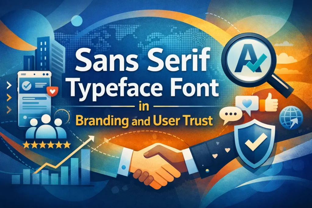
1. Sans-Serif Fonts (Most Recommended)


Sans-serif fonts are fonts that do not have little lines or strokes at the ends of letters (these are called “serifs”). They are generally cleaner and easier to read on screens, especially at smaller sizes.
Why they’re accessible:
- Simple, modern appearance
- Clear letter shapes
- Great for digital screens and mobile devices
Examples:
- Arial
- Helvetica
- Verdana
- Tahoma
- Open Sans
These fonts are a great choice for body text, menus, and forms because they reduce eye strain and improve clarity.
2. Serif Fonts (Use with Caution)

Serif fonts do have small lines or “feet” at the ends of the strokes in letters. While they are traditional and elegant, they can sometimes be harder to read on screens, especially for people with low vision or dyslexia.
Where they work well:
- Print materials
- Headings or quotes (if the font is large enough)
Examples:
- Times New Roman
- Georgia
- Merriweather
If you use serif fonts, make sure they’re large and have good spacing. Avoid using them for long paragraphs online.
3. Monospaced Fonts (For Code and Special Cases)
Monospaced fonts use the same amount of space for every character. They’re mostly used in programming or where alignment is important.
Examples:
- Courier New
- Consolas
These fonts are not ideal for regular content, but they can help some users (especially those with dyslexia) when used in small sections or coding environments.
4. Dyslexia-Friendly Fonts
Some fonts are specifically designed to help people with dyslexia read more easily. They often have heavier bottom weights, unique letter shapes, and more spacing between characters to reduce confusion between similar-looking letters like “b” and “d” or “p” and “q.”
Examples:
- OpenDyslexic
- Dyslexie
- Lexend
Benefits:
- Fewer letter reversals or misreads
- Better reading comfort for people with learning disabilities
However, always allow users to choose their own font if possible, since not everyone with dyslexia prefers these.
5. Fonts for Low Vision or Visual Impairments
Some fonts are designed for people with low vision. These fonts focus on maximizing clarity and distinct shapes.
Examples:
- Atkinson Hyperlegible
- Tiresias
- FS Me
Why they help:
- Extra spacing and bold lines
- Easily distinguishable characters
- Designed in partnership with visually impaired communities
These fonts are excellent for assistive technology compatibility and provide better reading support for older adults or users with degenerative vision issues.
Key Tips for Choosing Accessible Fonts
- Avoid decorative or cursive fonts: They look nice but are often hard to read.
- Limit the number of font types: Stick to 2–3 font families max per page to avoid visual clutter.
- Test with real users: The best font for your audience might depend on their needs—test and get feedback.
In summary, font families play a huge role in digital accessibility. A clear, well-chosen font can make your content easier to read, understand, and enjoy—no matter who is reading. When in doubt, go for clean, sans-serif fonts and always design with readability in mind.
The Role of Readability and Legibility
Readability
Refers to how easily words and blocks of text can be understood. Affects comprehension.
Legibility
Refers to how easily individual characters can be distinguished. Affects recognition.
Both are influenced by font size, weight, spacing, and contrast.
Future Trends in Accessible Typography
Variable Fonts
Enable real-time adjustments in weight, width, and slant, allowing users to customize text for their needs.
AI-Powered Personalization
Machine learning can adapt font sizes based on user interaction history and preferences.
Inclusive Design Systems
More companies are building accessibility-first design systems with typography at their core.
Font size is not just a stylistic choice—it’s a vital component of digital accessibility. By implementing scalable, readable, and user-friendly font sizes, designers and developers can ensure that their content is usable for everyone, including people with visual or cognitive impairments. Accessible typography leads to better engagement, lower bounce rates, and stronger inclusivity.
Accessibility is not a one-time checklist; it’s a continuous commitment to user-centered design. Start with font size, and you’ll already be making a big difference.
By focusing on font size for accessibility, you’re not just complying with standards you’re creating digital experiences that are welcoming, usable, and human-centered.
Frequently Asked Questions (FAQ)
What is the best font size for accessibility?
The best minimum font size for body text is 16px (1rem), but 18px to 20px is generally more accessible.
Is 14px too small for body text?
Yes, 14px is considered too small for most users, especially those with visual impairments.
How can I make my font size responsive?
Use relative units like rem and em and media queries to adapt sizes across devices.
Do font sizes affect screen readers?
Not directly, but good font sizing can improve the visual alignment of text with screen reader output.
What font type is best for accessibility?
Sans-serif fonts like Arial, Verdana, and OpenDyslexic are highly recommended for screen readability.
Can users override font sizes?
Yes, most browsers and devices allow users to adjust font sizes, especially if designs use scalable units like rem.


Leave a Comment