
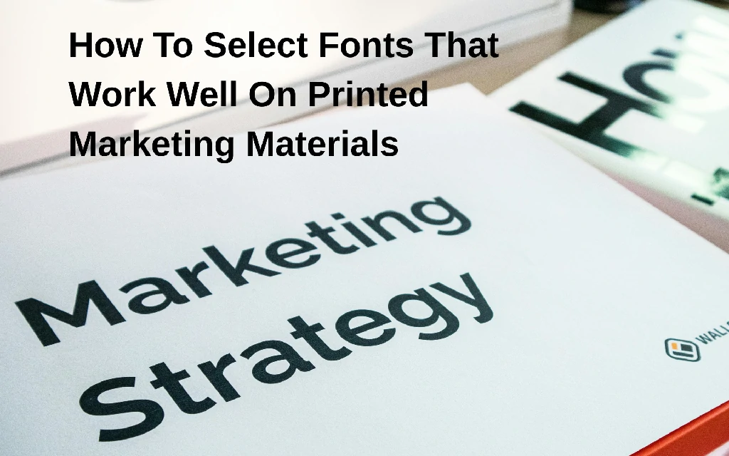
Ever picked up a beautifully designed brochure, only to squint at the tiny, illegible font?
It’s a common marketing mishap! Choosing the right fonts for your printed materials can be surprisingly tricky.
But don’t worry, this article is here to help you navigate the world of typography. We’ll explore how to select fonts that work well on printed marketing materials, ensuring your message is both seen and understood. Let’s dive in!
Understanding the Basics of Font Selection
Choosing the right font is more than just picking something that looks pretty. It’s about readability, branding, and conveying the right message.
Serif vs. Sans-Serif: Knowing the Difference
Serif fonts have small decorative strokes at the end of each letter. Think Times New Roman or Garamond.
Sans-serif fonts are cleaner and more modern, lacking those strokes. Arial and Helvetica are prime examples.
Generally, serif fonts are considered more readable for large blocks of text in print. Sans-serif fonts often work better for headlines and shorter text bursts.
Font Weight and Style: Making an Impact
Font weight refers to the thickness of the font. Light, regular, bold, and extra-bold are common options.
Font style includes italics, condensed, and extended versions.
Use font weight and style strategically to emphasize key words and phrases. But don’t overdo it!
Readability: The Most Important Factor
If people can’t read your marketing materials, they’re useless. Prioritize readability above all else.
Consider the font size, line height, and letter spacing.
Test your font choices on a printed proof before committing to a large print run.
Key Considerations When Selecting Fonts for Print
Several factors come into play when choosing fonts specifically for printed materials. Let’s break them down.
Target Audience: Who Are You Trying to Reach?
Think about your target audience. Are they young and trendy, or older and more traditional?
Your font choices should reflect their preferences and expectations.
A playful, whimsical font might work well for a children’s product, but it would be inappropriate for a financial services company.
Brand Identity: Maintaining Consistency
Your fonts should align with your overall brand identity.
Use the same fonts across all your marketing materials, both print and digital.
This creates a cohesive and recognizable brand image.
Print Method: How Are You Printing?
The print method can affect how your fonts appear.
Offset printing typically produces the best results with fine details.
Digital printing may require thicker fonts to avoid losing details.
Consider the paper stock as well. Coated paper will render fonts more sharply than uncoated paper.
Legibility at Different Sizes: Testing is Key
Always test your font choices at different sizes.
What looks great at 14pt might be illegible at 8pt.
Print out samples and evaluate them carefully.
Contrast: Making Text Stand Out
Ensure sufficient contrast between your text and background.
Dark text on a light background is generally easiest to read.
Avoid using light-colored fonts on light backgrounds, or dark fonts on dark backgrounds.
Practical Tips for Choosing Print-Friendly Fonts
Here are some practical tips to help you select fonts that work well on printed marketing materials.
Limit Your Font Choices: Less is More
Stick to a maximum of two or three fonts per design.
Too many fonts can create a cluttered and unprofessional look.
Choose one font for headlines and another for body text.
Pair Fonts Wisely: Finding the Right Balance
Pair a serif font with a sans-serif font for visual interest.
Ensure the fonts complement each other in terms of style and weight.
Use online font pairing tools for inspiration.
Consider Line Height and Letter Spacing: Enhancing Readability
Adjust the line height (leading) and letter spacing (tracking) to improve readability.
Slightly increase the line height for large blocks of text.
Adjust letter spacing to prevent letters from crowding together or appearing too far apart.
Use a Grid System: Creating Structure and Visual Appeal
A grid system helps you organize your content and create a visually appealing layout.
Align your text and images to the grid for a clean and professional look.
Proofread Carefully: Avoiding Costly Mistakes
Always proofread your text carefully before sending it to print.
Typos and grammatical errors can undermine your credibility.
Ask a colleague to proofread as well, for a fresh pair of eyes.
Examples of Fonts That Work Well in Print
Here are some popular and reliable font choices for printed marketing materials:
- Serif Fonts:
- Garamond
- Times New Roman
- Georgia
- Baskerville
- Sans-Serif Fonts:
- Helvetica
- Arial
- Open Sans
- Roboto
These fonts are widely available, highly readable, and work well in a variety of print applications.
Tools and Resources for Font Selection
There are many online tools and resources to help you select fonts that work well on printed marketing materials.
- Google Fonts: A vast library of free, open-source fonts.
- Adobe Fonts: A subscription-based service offering a wide range of high-quality fonts.
- FontPair: A website that suggests font pairings.
- Canva Font Combinations: A tool that helps you find complementary fonts within Canva.
Experiment with different fonts and tools to find what works best for your brand and your specific project.
Avoiding Common Font Mistakes in Print Design
Let’s cover some common pitfalls to avoid when choosing fonts for print.
Using Too Many Fonts: Keep it Simple
As mentioned earlier, resist the urge to use too many different fonts. It creates a chaotic and unprofessional look.
Ignoring Readability: Function Over Form
Don’t sacrifice readability for the sake of aesthetics.
If people can’t read your message, your design has failed.
Choosing Fonts That Are Too Similar: Lack of Contrast
Avoid choosing fonts that are too similar to each other.
This can make your design look monotonous and uninspired.
Using Fonts That Are Not Licensed for Commercial Use: Legal Issues
Ensure that you have the appropriate license to use your chosen fonts for commercial purposes.
Using unlicensed fonts can lead to legal issues.
Overusing Decorative Fonts: Readability Problems
Decorative fonts can be fun, but they are often difficult to read.
Use them sparingly, if at all, and only for short headlines or accents.
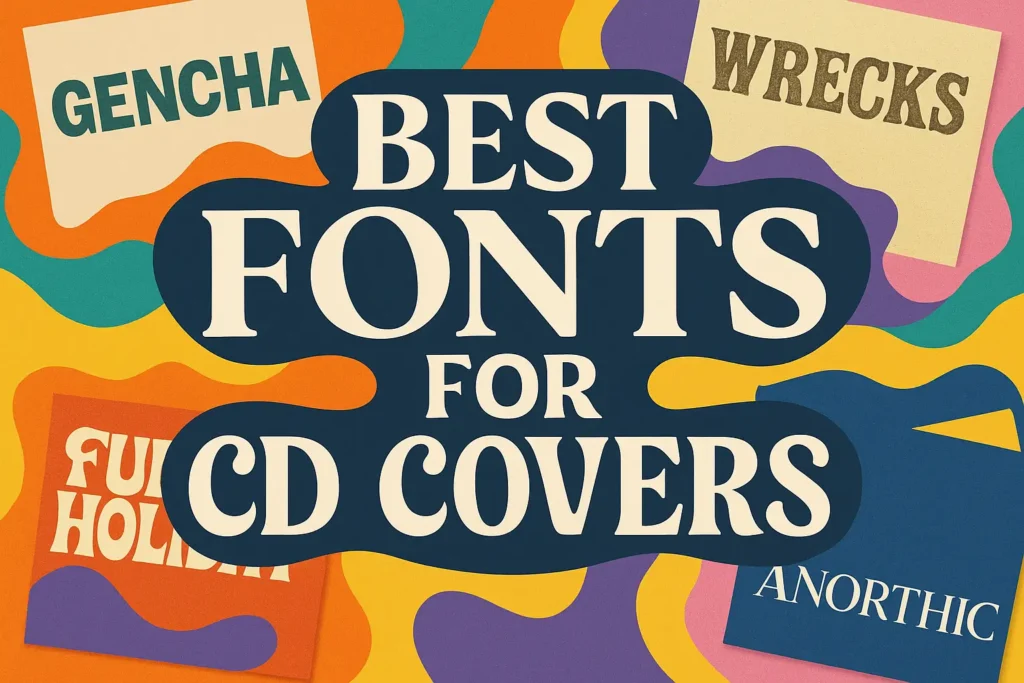
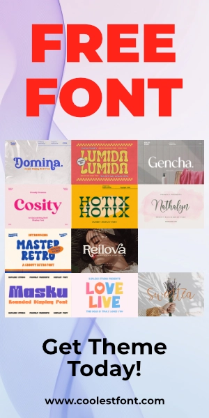
Alternative Fonts That Work Well On Printed Marketing Materials
When it comes to printed marketing materials—like brochures, flyers, posters, and packaging—choosing the right font is key. You need something that’s not only eye-catching but also easy to read and reflective of your brand personality. Here are some font recommendations from Coolest Font that will make your printed designs stand out:
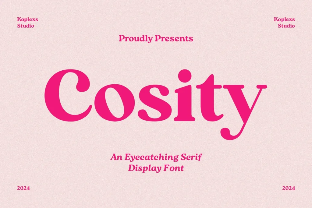
1. Cosity – Display Serif Font
Cosity blends modern elegance with vintage charm. It’s perfect for high-end product brochures, beauty packaging, or fashion-related prints that need a classy, bold presence.
2. Bourne Font
Simple, strong, and modern—Bourne is a versatile display font that can handle anything from startup flyers to tech conference brochures.

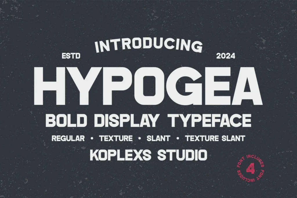
3. Hypogea Font
If you want a font with edge and personality, Hypogea is a bold choice. Ideal for striking posters, music event flyers, or modern product packaging.
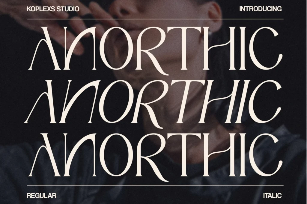
4. Anorthic – Modern Serif Font
Anorthic delivers a blend of classic and modern. It’s stylish yet serious—perfect for editorials, law firm brochures, or high-end product descriptions.
5. Cofigra – Modern Sans Serif Font
Cofigra is a clean and contemporary sans serif font, ideal for creating a professional and modern look in printed materials.

6. Gantic – Modern Serif Font
Gantic offers a refined serif design that balances tradition and modernity, ideal for conveying trust and professionalism in print materials.

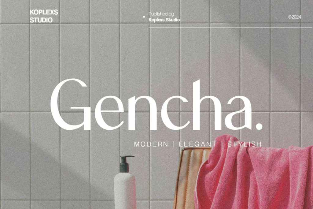
7. Gencha – Sans Serif Font
Gencha is a versatile sans serif font that provides a clean and minimalist look, enhancing readability in print.
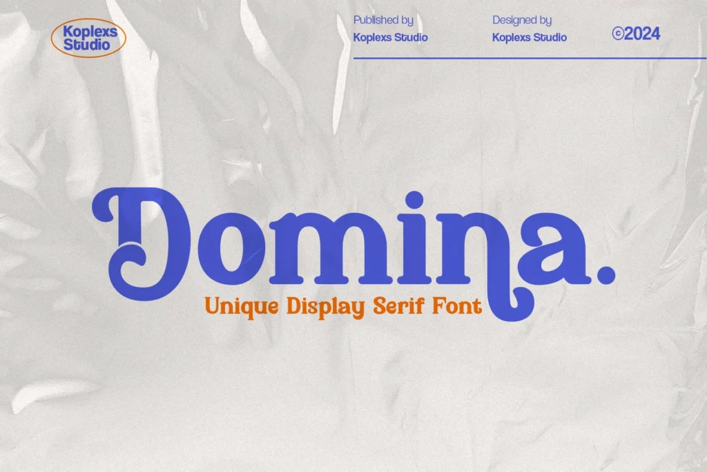
8. Domina – Display Serif Font
Domina’s bold and elegant serif style makes it an excellent choice for attention-grabbing headlines in printed advertisements and posters.
These fonts are available for download at CoolestFont.com. When selecting fonts for printed marketing materials, consider the tone and message of your brand to ensure consistency and effectiveness.
If you need further assistance in choosing the right font for your specific project, feel free to ask!
Conclusion
Choosing the right fonts for your printed marketing materials is crucial for conveying your message effectively and reinforcing your brand identity. By understanding the basics of font selection, considering key factors like target audience and print method, and following practical tips, you can select fonts that work well on printed marketing materials and create visually appealing and highly readable designs. Don’t be afraid to experiment and test different options until you find the perfect fit!
What are your favorite font pairings for print? Share your experiences in the comments below!
FAQ: How to Select Fonts That Work Well on Printed Marketing Materials
Q: What is the ideal font size for printed materials?
A: The ideal font size depends on the font itself, the target audience, and the viewing distance. However, as a general guideline, aim for a font size of 10-12pt for body text and 14-18pt or larger for headlines. Always test your font choices at different sizes to ensure readability.
Q: How can I ensure my fonts will print correctly?
A: To ensure your fonts print correctly, embed them in your PDF file when submitting it to the printer. This will prevent font substitution issues. Also, provide your printer with a hard copy proof for reference.
Q: Where can I find free fonts for commercial use?
A: Google Fonts is a great resource for finding free fonts that are licensed for commercial use. Be sure to carefully review the license agreement for each font before using it in your projects.


Leave a Comment