Discover the top 30 good fonts for resumes that can help you impress recruiters and boost your chances of landing the job.
Good Fonts for Resumes. In today’s competitive job market, your resume is your first impression—it’s your ticket to securing an interview and ultimately landing the job. While content is crucial, the design and presentation of your resume are just as important. One of the most overlooked aspects of resume design is font choice. The right font can make your resume look professional, polished, and easy to read, while the wrong font can send it straight to the rejection pile.
Choosing a good font for your resume is more than just a stylistic choice; it’s a strategic one. The right font ensures that your resume is both aesthetically pleasing and highly readable, making it easier for hiring managers to focus on your qualifications rather than struggle to decipher your text. In this article, we will explore the best fonts for resumes, providing you with a curated list of options that will help you stand out from the crowd.
Why Font Choice Matters in Resumes
When crafting a resume, every detail counts. The font you choose is more than just a design element—it’s a crucial factor that influences how your resume is perceived. A well-chosen font enhances readability, which is essential since hiring managers typically spend just 6-7 seconds on an initial resume scan . If your resume is hard to read or visually overwhelming, you risk losing the recruiter’s attention before they even get to your qualifications.
Moreover, the font you use contributes to the overall tone of your resume. A clean, modern font conveys professionalism and competence, while an overly decorative font can come across as unprofessional or difficult to read. Given the importance of first impressions, your font choice should align with the professional image you wish to project.
Characteristics of a Good Resume Font
A good resume font should be:
- Readable: The font should be easy to read both on screen and in print. Avoid fonts that are too ornate or have excessive flourishes.
- Professional: Stick to classic fonts that are commonly used in business documents. This conveys a sense of reliability and professionalism.
- Simple: Simplicity is key. Complex fonts can be distracting and may detract from the content of your resume.
Fonts to Avoid:
- Comic Sans: Often seen as unprofessional and juvenile.
- Papyrus: Too decorative and can be difficult to read in smaller sizes.
- Brush Script: While it may look stylish, it lacks the professionalism needed for a resume.
Choosing the right font for your resume is crucial in making a great first impression on potential employers. The fonts listed here are highly recommended for their balance of readability, professionalism, and aesthetic appeal. Each font has unique characteristics that can help your resume stand out while maintaining the level of formality expected in professional documents.
30 Good Fonts for Resumes
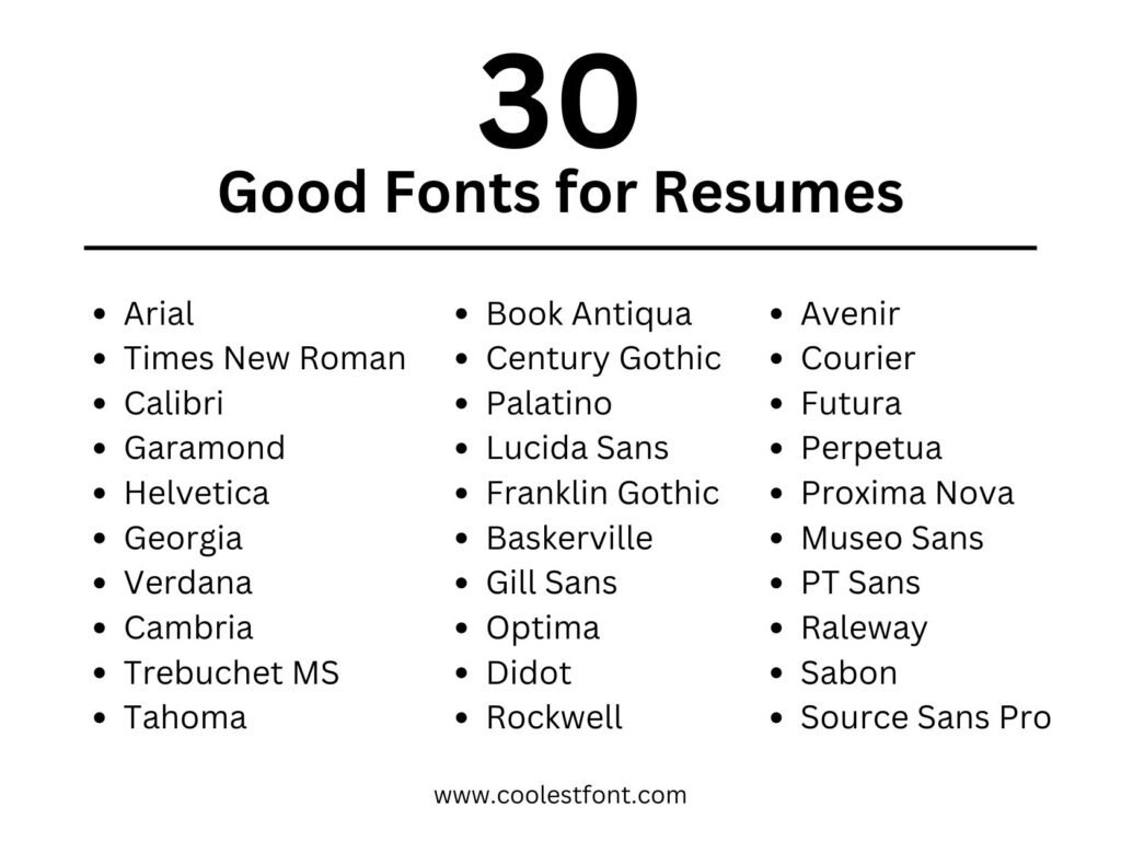
Selecting the perfect font for your resume requires careful consideration of factors such as industry standards, personal branding, and the overall readability of the document. With so many options available, it can be challenging to determine which font will best represent you and your qualifications. In this article, we will explore the top 30 fonts for resumes, providing detailed insights into each option to help you make an informed decision. Whether you’re applying for a creative role, a technical position, or a job in a traditional industry, this guide will help you choose a font that enhances your resume and leaves a lasting impression on recruiters.
1. Arial Font
Arial is a sans-serif font that has been a staple in professional documents for many years. Known for its clean lines and simplicity, Arial is easy to read and works well in both digital and print formats. Its neutral design makes it versatile, suitable for almost any industry or job role.
- Why it’s good for resumes: Arial’s simplicity ensures that your resume looks clean and professional. It’s highly legible, even in smaller font sizes, which is important for recruiters who may skim through your document quickly.
- When to use it: Arial is an excellent choice for those applying to positions in traditional industries like finance, law, or education, where a straightforward, no-nonsense presentation is preferred.
2. Times New Roman Font
Times New Roman is a classic serif font that has long been associated with professionalism and formality. Its traditional appearance makes it a go-to choice for resumes, particularly in conservative fields.
- Why it’s good for resumes: The serif design of Times New Roman guides the eye along the lines of text, making it easier to read in longer documents. It also conveys a sense of reliability and tradition, which can be appealing to employers in established industries.
- When to use it: This font is ideal for roles in academia, government, or any sector where a formal tone is required. However, pairing it with modern design elements can prevent it from looking outdated.
3. Calibri Font
Calibri has quickly become one of the most popular fonts for resumes since it was introduced as the default font in Microsoft Office. Its rounded edges and modern design make it friendly yet professional, striking a balance that appeals to a wide range of employers.
- Why it’s good for resumes: Calibri is highly readable and looks clean on both digital screens and printed pages. Its modern appearance helps your resume feel current without sacrificing professionalism.
- When to use it: Calibri is versatile enough for almost any industry, but it’s particularly well-suited for roles in tech, marketing, or any field that values a modern approach.
4. Garamond Font
Garamond is a serif font that brings a touch of elegance and sophistication to your resume. Its timeless design combines the classic appeal of a serif font with a refined, artistic quality that sets it apart from more common choices.
- Why it’s good for resumes: Garamond’s elegant appearance can give your resume a distinctive, polished look, which is particularly effective in creative or cultural fields. Despite its stylish nature, it remains highly readable.
- When to use it: Use Garamond when applying for roles in industries like publishing, graphic design, or any job where creativity and attention to detail are valued.
5. Helvetica Font
Helvetica is a favorite among designers and typographers for its clean, minimalist aesthetic. As a sans-serif font, Helvetica is modern, highly readable, and exudes a professional vibe that can make your resume stand out without being flashy.
- Why it’s good for resumes: Helvetica’s straightforward design ensures that your resume is easy to read while looking crisp and organized. Its neutral appearance makes it suitable for a wide range of job applications.
- When to use it: This font is an excellent choice for positions in creative fields, tech, and design, where a modern and sleek presentation is appreciated.
6. Georgia Font
Georgia is a serif font designed specifically for enhanced readability on digital screens. It combines the classic characteristics of a serif font with the practicality needed for online documents, making it an excellent choice for resumes in today’s digital job market.
- Why it’s good for resumes: Georgia’s strong legibility on screens ensures that your resume is easy to read when viewed on a computer or mobile device. Its traditional serif design adds a touch of formality, making it suitable for professional documents.
- When to use it: Georgia is ideal for digital resumes and portfolios, especially in fields like media, marketing, or any industry where digital literacy is important.
7. Verdana Font
Verdana is a sans-serif font known for its wide spacing and clear letterforms, making it exceptionally easy to read on screens. It’s often used in web design for its readability, but it also works well in printed documents.
- Why it’s good for resumes: Verdana’s generous spacing between characters makes your resume comfortable to read, even at smaller sizes. This can be particularly beneficial if you need to fit a lot of information onto one page without compromising readability.
- When to use it: Consider Verdana if you’re applying for roles in tech, customer service, or other fields where clarity and communication are key.
8. Cambria Font
Cambria is a serif font that, like Georgia, was designed with digital readability in mind. It offers a bit more formality than Georgia, making it a great choice for resumes that need to convey a sense of professionalism.
- Why it’s good for resumes: Cambria’s design is well-suited for both digital and print formats, ensuring that your resume looks sharp and professional regardless of how it’s viewed. Its balanced letterforms make it an easy-to-read option.
- When to use it: Cambria is particularly effective for resumes in fields like law, finance, or education, where a formal and polished presentation is necessary.
9. Trebuchet MS Font
Trebuchet MS is a sans-serif font that offers a modern, clean look while still being slightly less conventional than Arial or Calibri. It’s a great choice for those who want their resume to stand out in a subtle way.
- Why it’s good for resumes: Trebuchet MS has a modern, fresh appearance that can make your resume feel contemporary and unique. Its readability and balanced spacing make it a practical choice for various industries.
- When to use it: This font is well-suited for creative roles, startups, or industries that value innovation and forward-thinking.
10. Tahoma Font
Tahoma is a sans-serif font with a slightly narrower letterform, making it a good option when space is at a premium on your resume. Its clean and straightforward design ensures your resume remains professional and easy to read.
- Why it’s good for resumes: Tahoma’s narrow spacing allows you to include more content on a single page without sacrificing readability. Its clear and consistent letterforms make it a solid choice for any professional document.
- When to use it: Tahoma is a great choice for resumes in technical fields, administration, or roles that require detailed information to be presented clearly and concisely.
11. Book Antiqua Font
Book Antiqua is a serif font that offers a timeless and refined look. It’s similar to Palatino, another classic serif, but with a slightly more modern touch. Book Antiqua is ideal for resumes in academic, publishing, or literary fields where a formal, yet approachable tone is desired.
12. Century Gothic Font
Century Gothic is a sans-serif font with a sleek, modern appearance. Its geometric shapes and clean lines give it a futuristic feel, making it a great choice for tech or creative industries. Century Gothic stands out for its distinctive style, but its wide letter spacing means it requires careful layout planning to avoid wasting space.
13. Palatino Font
Palatino is a classic serif font known for its elegance and readability. It’s often used in publishing, making it a good choice for writers, editors, and academics. Palatino’s classic yet modern look can make your resume stand out while still adhering to traditional design principles.
14. Lucida Sans Font
Lucida Sans is a sans-serif font that’s designed for maximum readability, even at small sizes. It’s a practical choice for resumes that need to be concise and clear, especially for digital submissions. Lucida Sans is particularly effective for tech, engineering, and scientific roles where clarity is key.
15. Franklin Gothic Font
Franklin Gothic is a bold, sans-serif font that conveys strength and professionalism. It’s commonly used in headlines and titles, but also works well for resume body text if used sparingly. Franklin Gothic is ideal for roles in marketing, advertising, or any field where a strong, impactful presence is needed.
16. Baskerville Font
Baskerville is a serif font known for its elegance and formality. It’s a great choice for roles in law, finance, or academia where a traditional, authoritative tone is required. Baskerville’s classic design lends a sophisticated air to any resume, making it stand out in more conservative industries.
17. Gill Sans Font
Gill Sans is a sans-serif font with a clean, modern design. It’s versatile and works well in a variety of industries, from creative fields to more corporate environments. Gill Sans is known for its readability and professional appearance, making it a solid choice for any resume.
18. Optima Font
Optima is a sans-serif font that blends the classic elegance of serif fonts with the modern simplicity of sans-serif designs. It’s a good choice for roles that require both creativity and professionalism, such as design, marketing, or management positions. Optima’s unique style helps your resume stand out while maintaining a polished look.
19. Didot Font
Didot is a serif font known for its high contrast between thick and thin strokes, giving it a dramatic, elegant appearance. It’s best suited for creative industries or high-end roles where a touch of luxury is desired. Didot can make your resume look refined and sophisticated, but it should be used sparingly to avoid overwhelming the reader.
20. Rockwell Font
Rockwell is a slab-serif font that’s bold and confident. It’s a good choice for roles in fields like architecture, engineering, or design where a strong, solid presence is important. Rockwell’s unique style can make your resume stand out, but it should be used carefully to avoid coming across as too aggressive.
21. Avenir Font
Avenir font is a modern, geometric sans-serif font known for its clarity and elegance. It’s a great choice for creative professionals who want a clean, modern look without sacrificing readability. Avenir’s versatility makes it suitable for both digital and print resumes, and it pairs well with a variety of design elements.
22. Courier Font
Courier is a monospaced serif font that mimics the look of typewritten text. It’s a good choice for tech or engineering roles where a retro, technical look is desired. Courier’s unique style can make your resume stand out, but it’s important to ensure that it remains readable and professional.
23. Futura Font
Futura is a geometric sans-serif font known for its clean, modern appearance. It’s a popular choice in design and architecture, where a sleek, minimalist look is valued. Futura’s strong lines and balanced spacing make it a great choice for resumes in creative industries, though it may be less suitable for more traditional fields.
24. Perpetua Font
Perpetua is a serif font with a classic, timeless look. It’s often used in academic and literary fields where a formal, refined tone is needed. Perpetua’s elegance and readability make it a strong choice for resumes in these industries, helping to convey authority and professionalism.
25. Proxima Nova Font
Proxima Nova is a sans-serif font that’s popular in web design for its clean, modern appearance. It’s a great choice for digital resumes, especially in creative and tech industries. Proxima Nova combines readability with a contemporary style, making it an excellent option for those looking to make a strong impression online.
26. Museo Sans Font
Museo Sans is a sans-serif font with a modern, geometric design. It’s ideal for creative professionals who want a unique, stylish resume that still maintains readability. Museo Sans stands out for its distinctive character shapes, making your resume memorable while keeping the text clear and accessible.
27. PT Sans Font
PT Sans is a versatile, modern sans-serif font that’s easy to read and works well in both print and digital formats. It’s a good choice for a wide range of industries, from tech to education, and its clean design ensures that your resume remains professional and polished.
28. Raleway Font
Raleway is a modern, elegant sans-serif font that’s well-suited for creative industries. It has a sleek, minimalist appearance that can make your resume look both professional and stylish. Raleway’s unique character shapes add a touch of personality to your resume, helping you stand out in a competitive job market.
29. Sabon Font
Sabon is a serif font known for its classic, elegant design. It’s often used in publishing and academia, where a formal, authoritative tone is required. Sabon’s refined appearance makes it a great choice for resumes in these fields, helping to convey a sense of reliability and professionalism.
30. Source Sans Pro Font
Source Sans Pro font is a modern, sans-serif font designed for optimal readability on screens. It’s a great choice for digital resumes, especially in tech and creative industries. Source Sans Pro’s clean lines and balanced spacing make it easy to read, ensuring that your resume is both professional and accessible.
These fonts are all excellent choices for creating a resume that not only looks professional but also communicates your qualifications effectively. By choosing the right font, you ensure that your resume is easy to read and leaves a positive impression on potential employers.
How to Choose the Right Font for Your Resume
Selecting the right font depends on several factors, including the industry you’re applying to, the role, and your personal brand. Here are some tips to help you make the right choice:
- Match the Font to the Industry: For traditional fields like law or finance, stick to classic serif fonts like Times New Roman or Garamond. For creative roles, consider modern sans-serif fonts like Helvetica or Trebuchet MS.
- Consider Readability: Make sure the font is easy to read both on screen and in print. Avoid overly decorative fonts that may look good on a computer but are hard to read in print.
- Test Different Fonts: Don’t be afraid to experiment with a few different fonts before settling on the one that best represents your professional image.
Common Mistakes to Avoid When Choosing a Resume Font
- Using Decorative Fonts: While they might look attractive, decorative fonts can be hard to read and may appear unprofessional.
- Inconsistent Font Use: Stick to one or two fonts throughout your resume to maintain a clean and cohesive look.
- Overuse of Bold or Italic: Use these styles sparingly to emphasize key points, but don’t overdo it as it can make your resume look cluttered.
Conclusion
Choosing the right font for your resume is a critical step in creating a document that’s both professional and readable. The fonts listed above are some of the best options available, each offering a unique balance of style and functionality. Remember, the goal is to make your resume as easy to read as possible while also conveying your professionalism.
As you prepare your resume, take the time to choose a font that aligns with your industry and the role you’re applying for. A well-chosen font can enhance the overall presentation of your resume and increase your chances of landing that interview.
Thank you for reading! We hope this guide has helped you in selecting the perfect font for your resume. For more tips on resume writing and job search strategies, explore our other articles. Don’t forget to share this article with your friends and colleagues who might benefit from these insights. Good luck with your job search, and remember to keep your resume updated to reflect the latest trends in the job market.



Leave a Comment